Home / Works / rahat

rahatmarket delivery app

Food-delivery platform
Senior Designer · Product Designer 2021 — 2022 Baku

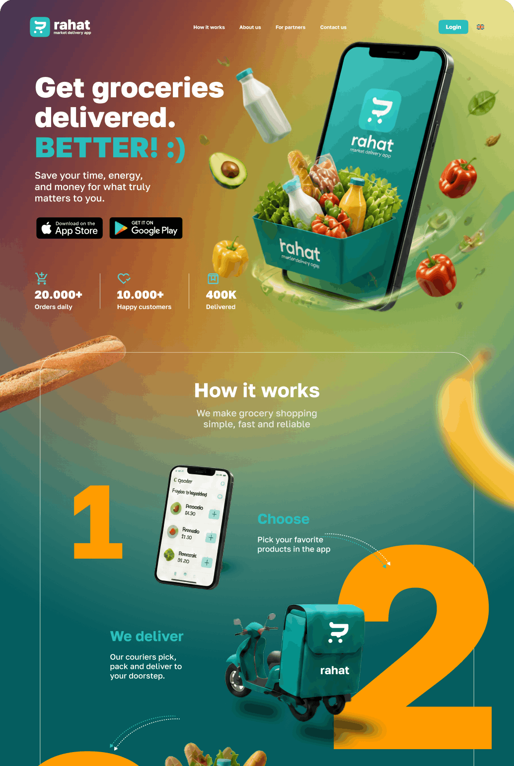
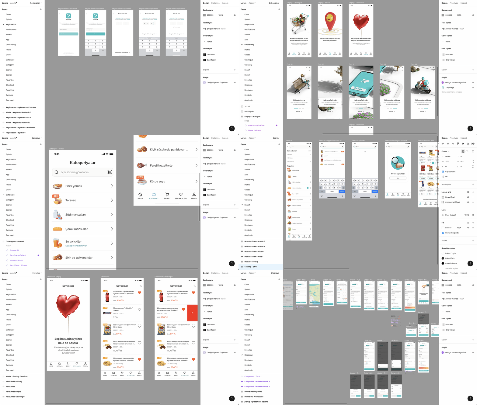
rahat.app is a fully considered, end-to-end food-delivery platform — one that became especially relevant after the pandemic. I designed the landing page for both customers and partners, plus the apps and services behind every part of the operation: the customer app, the picker, the manager, the courier and more. The system can govern absolutely every step, from order to doorstep.


Download on the App Store Get it on Google Play
rahat marketing landing page — desktop
rahat marketing landing page — mobile
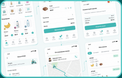
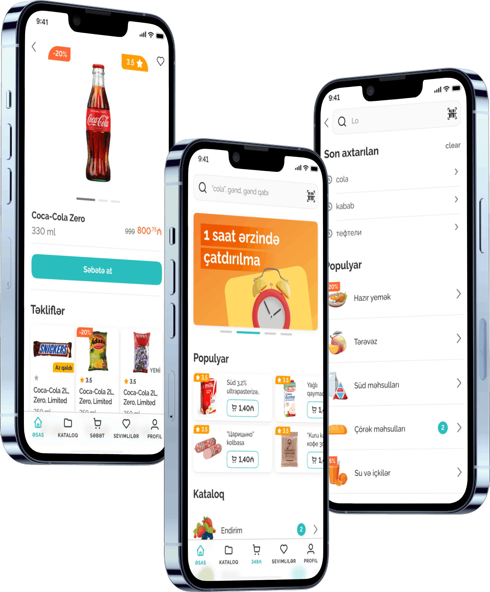
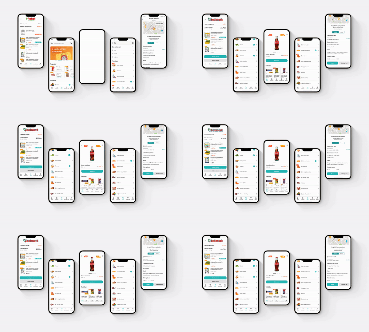
rahat customer app

Client

  • The customer browses products and places an order
  • Adjusts the details — brand, quantity, weight and so on
  • Enters where to deliver
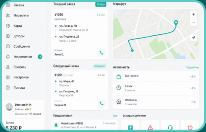
rahat courier & delivery dashboard

Delivery

  • Market staff pick and pack the order
  • The courier gets a notification
  • Picks it up and delivers to the door
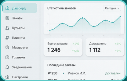
rahat admin dashboard

Admin

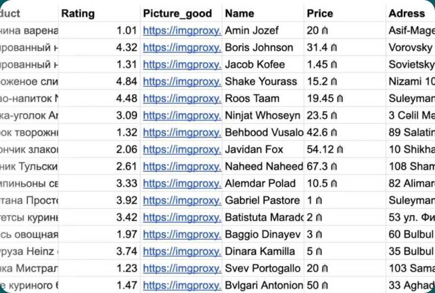
  • Content is filled in through the admin panel
  • Processes are configured and managed

Card redesign

What I would change on this screen today — with the experience I did not have in 2021. Top to bottom.

  1. Move the labels off the main photo and down below — they compete with the product
  2. Give the icons on top a backdrop so they stop dissolving into a light background
  3. Run incoming photos through one AI pipeline: one angle, one light, one background
  4. Make the product name bigger
  5. Show the unit price explicitly
  6. Rework the text styles
  7. Move the price into the button

The screen — drag to compare

rahat product screen as it shipped in 2021 The same screen with all seven changes applied
20212026

Sources — 2021

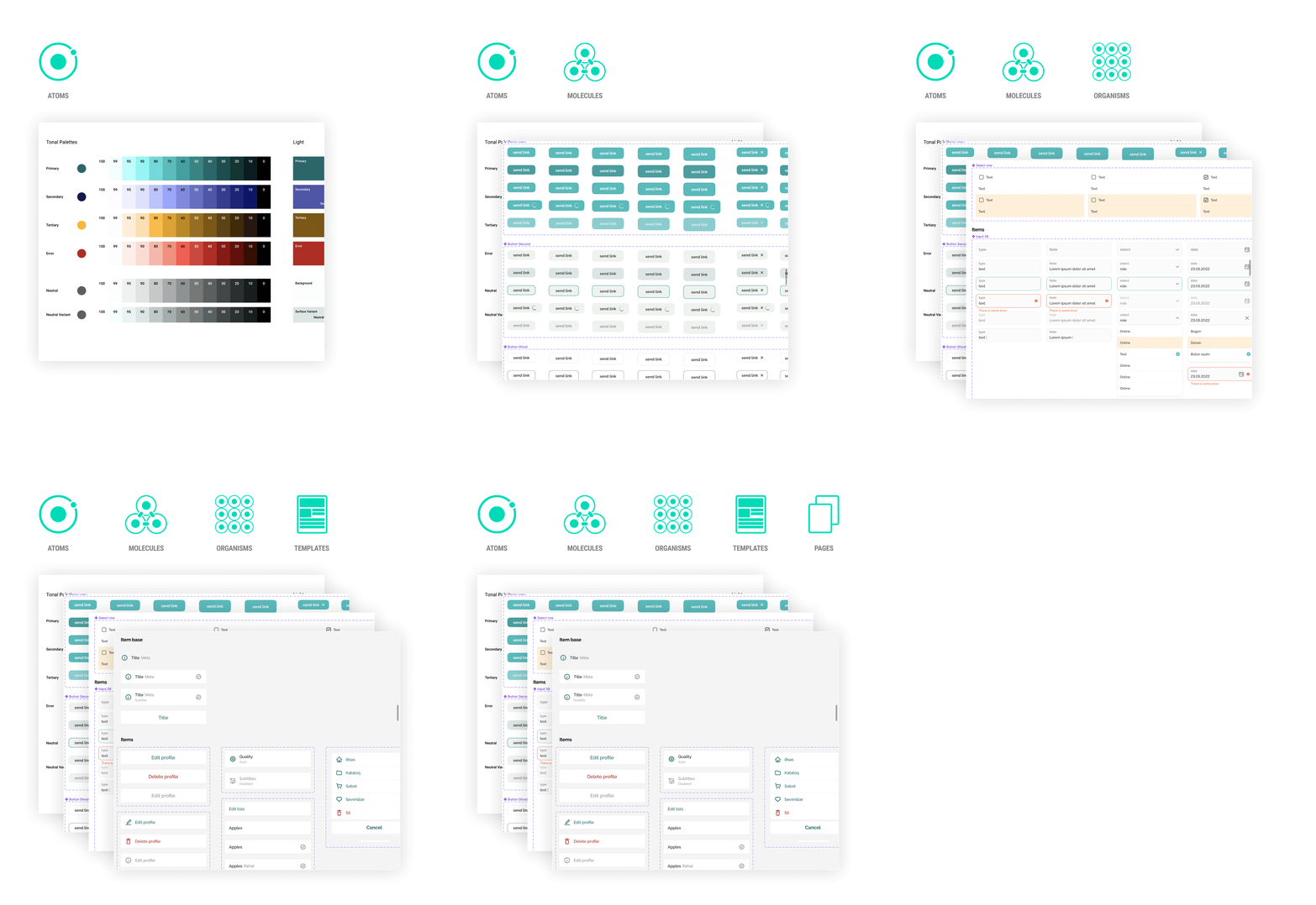
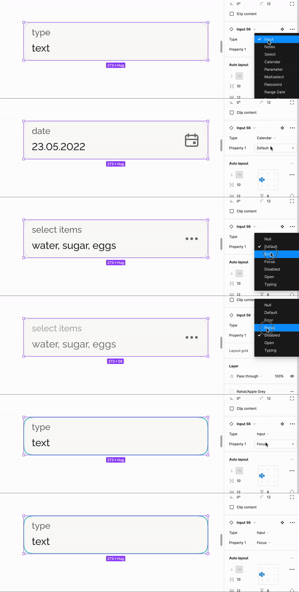
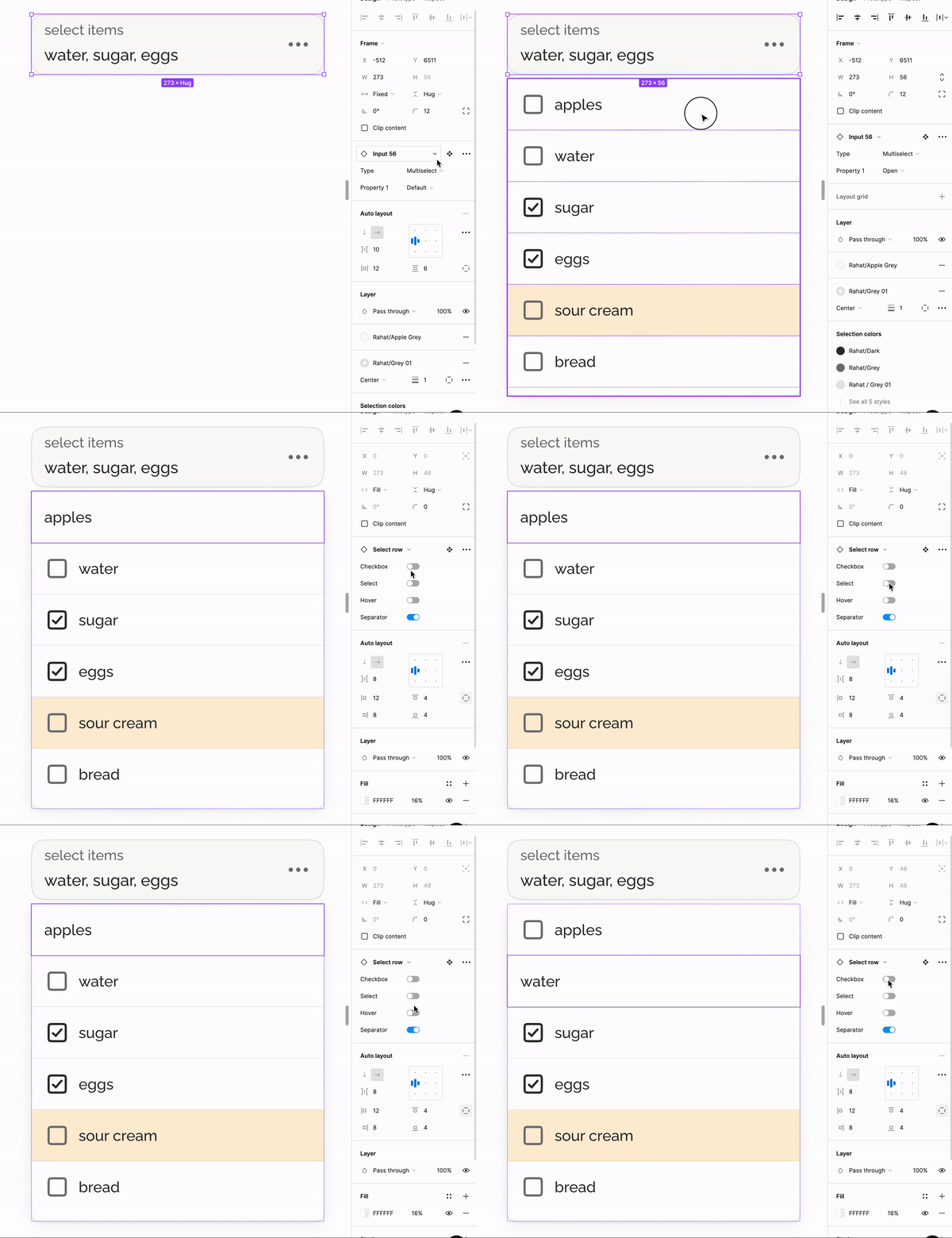
I built one master component and branched the whole series off it. Back then every status — Sale, New, Low — kept its own variant. Two statuses at once? One more variant for the combination. Add the card with a quantity counter and the entire set of states repeated from scratch.

The combinatorics grew faster than the value. Booleans and variables arrived later and closed exactly this pain.

The 2021 Figma library — one variant per status combination

Sources — 2026

Labels became booleans: switched on and off from the properties panel, with no component clones.

I gave the objects air — the outline came off the price tag. It is still a button, just without the frame.

That was not enough, so I assembled a wide version: it takes almost the same height and reads noticeably better.

Image format went to 4:3 — the way the product is actually photographed.

The 2026 Figma library — labels as booleans, one component
Label boxes, before and after

The labels went into plain boxes that do not wrap around the corner — cleaner.

A rating can be missing altogether, so it moved down, after the pack size.

Catalog density

Before

The old catalog grid

In the old grid the objects had no air — they got in each other's way.

After

The new catalog grid

The new grid lets the objects breathe and leaves room for controls, should they ever be needed.

What came out

On the left, the card as it shipped in 2021; on the right, the same card rebuilt today.

from 2021 to 2026

2026

What's under the hood

  • Tons of discussion, reviews, dealing with management, markets, compliance, hypotheses and more
  • Design system
  • Icons
  • 3D models
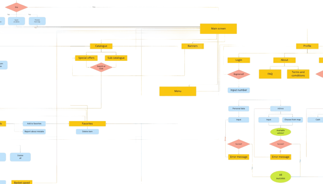
  • CJM & user flows
  • App screens
  • Desktop screens
  • Landing page
  • Marketing materials
rahat app screens on three phones
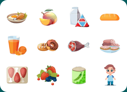
Custom rahat icon set
Custom icons
rahat animations
Animations
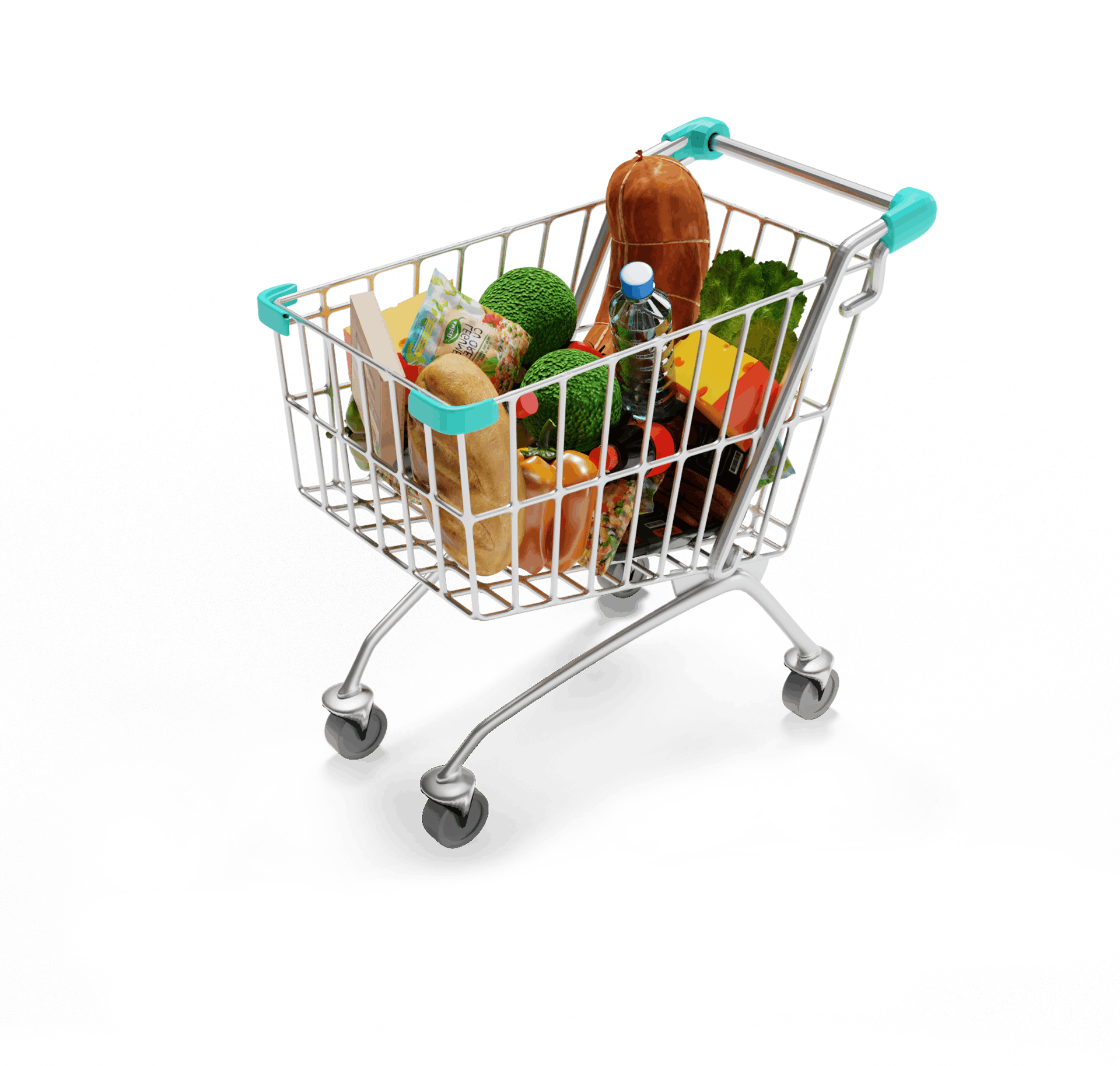
rahat 3D objects
3D images
7 mo.
To launch-ready
3
Apps
+138%
Growth