
One marketplace, five roles — buyers, jewelers, lombards, handmade sellers and admins, each on a surface built for the way they actually work.


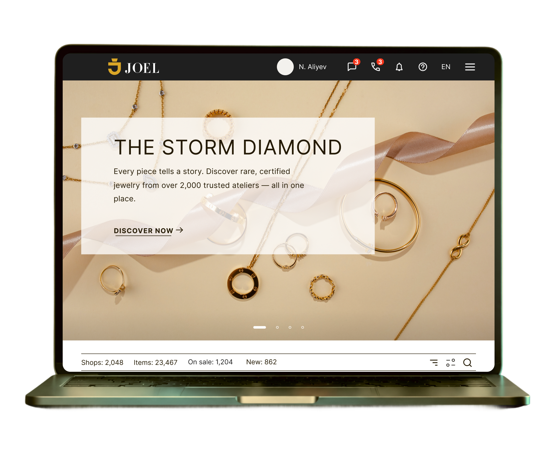
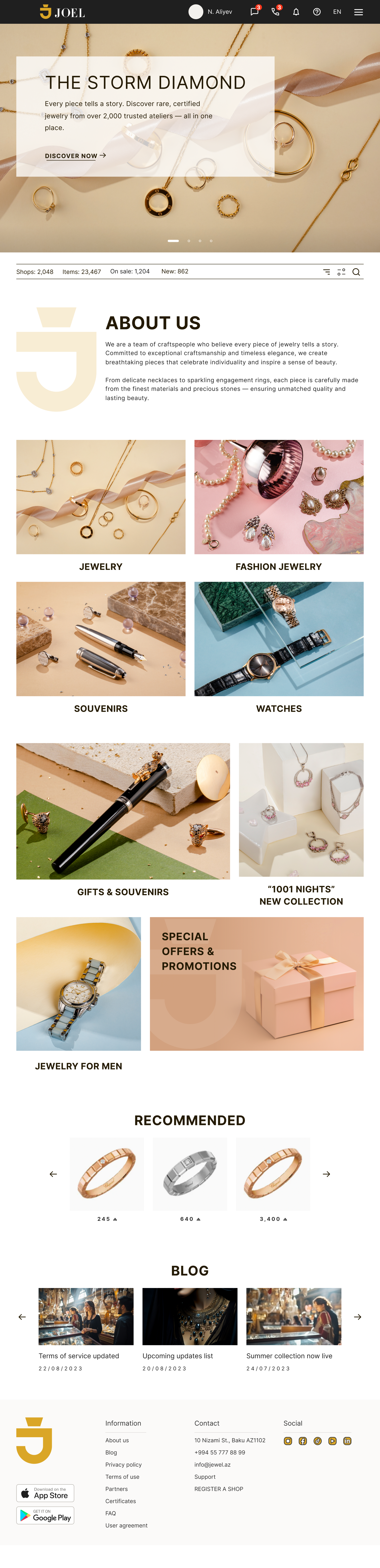
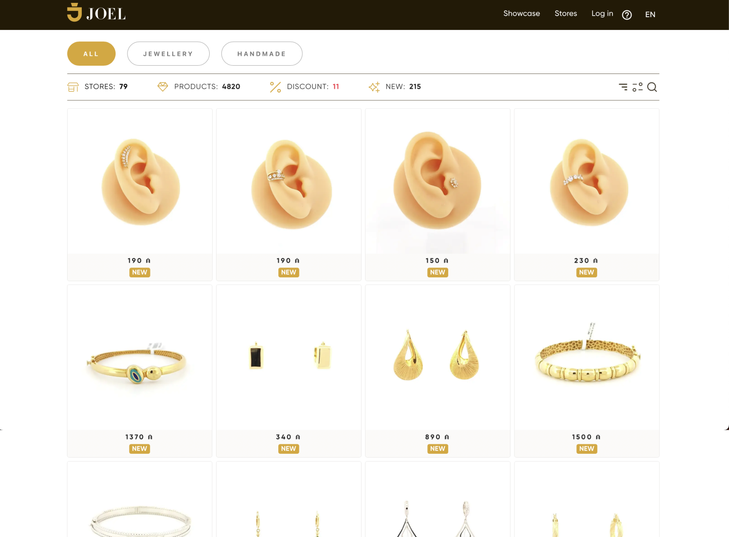
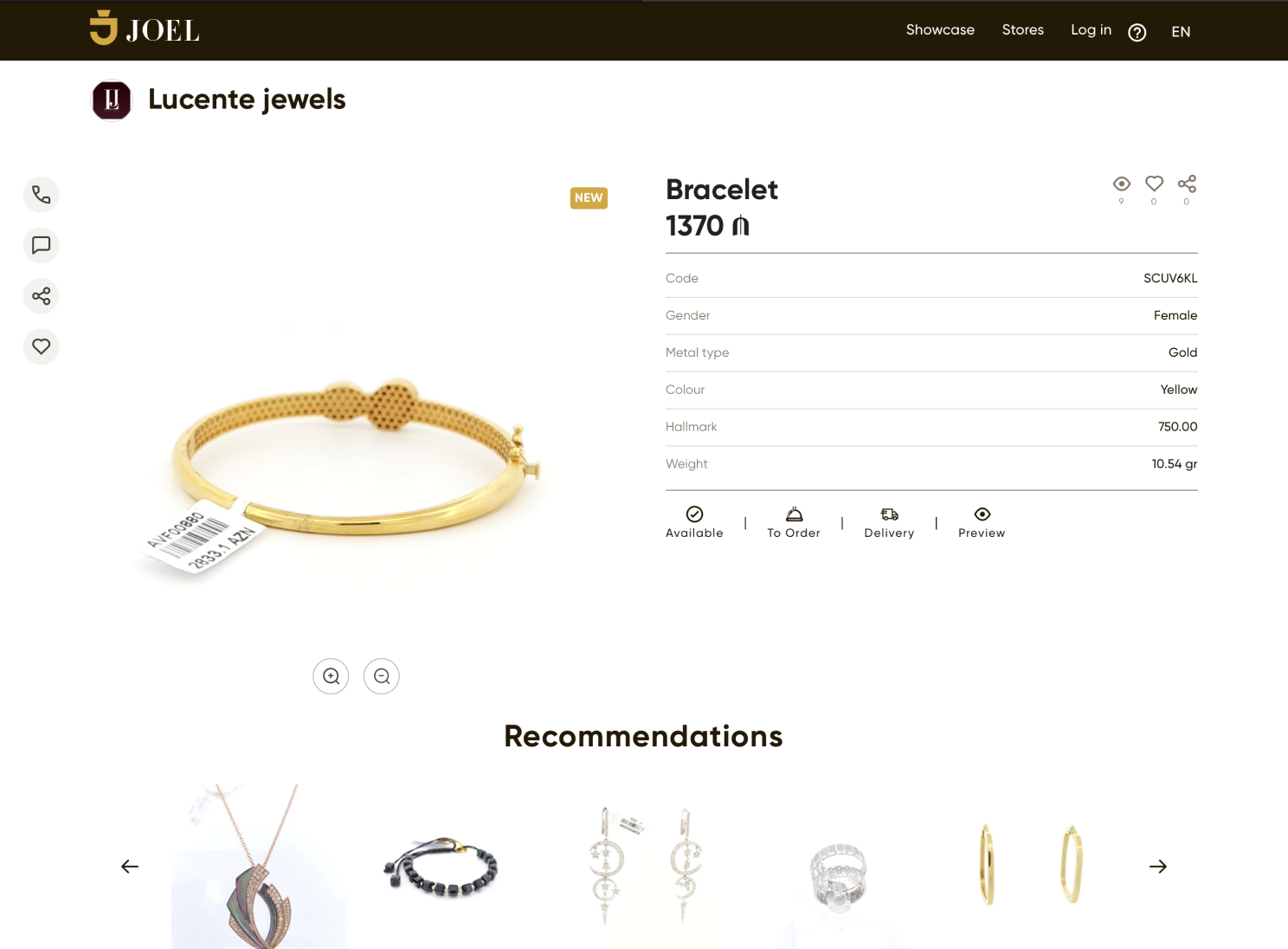
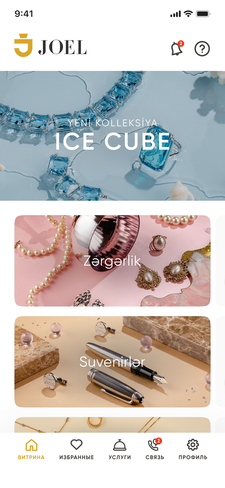
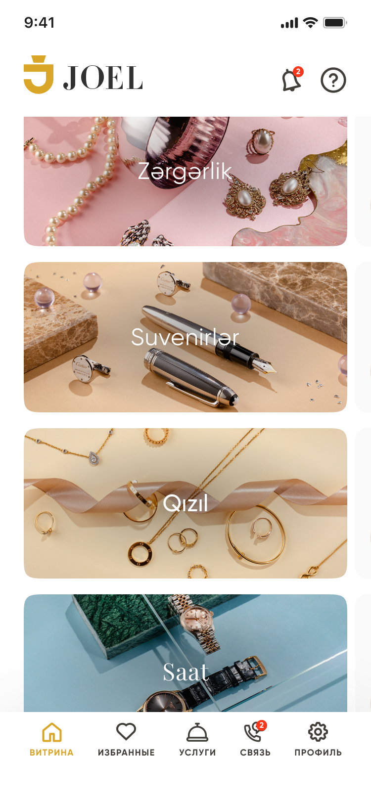
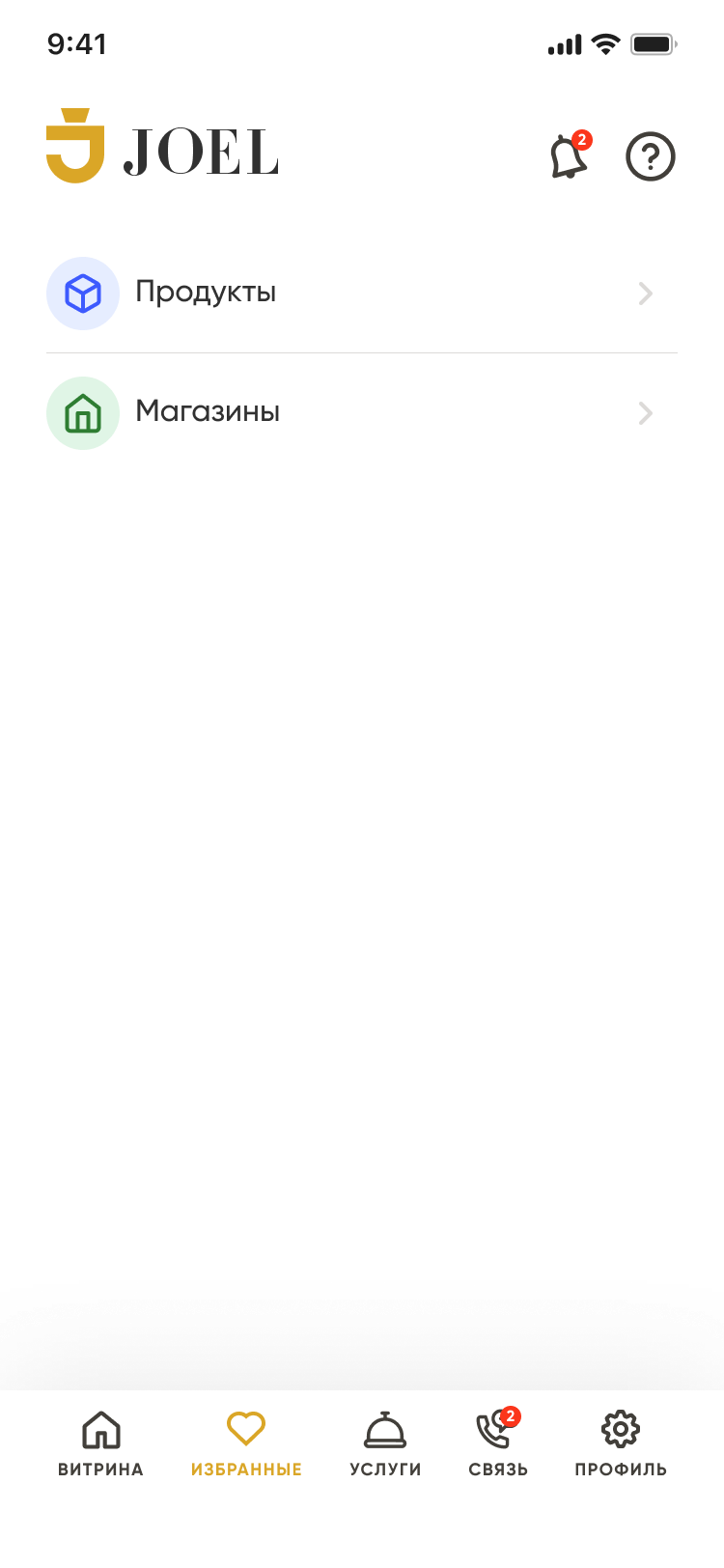
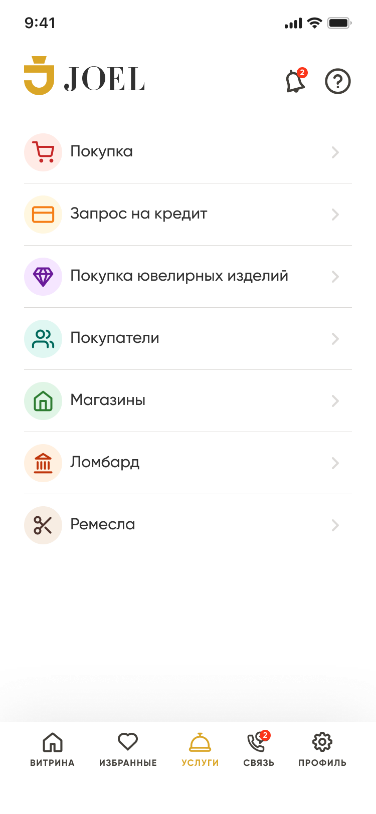
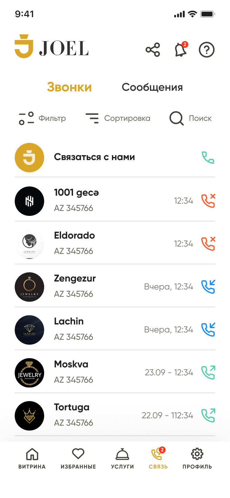
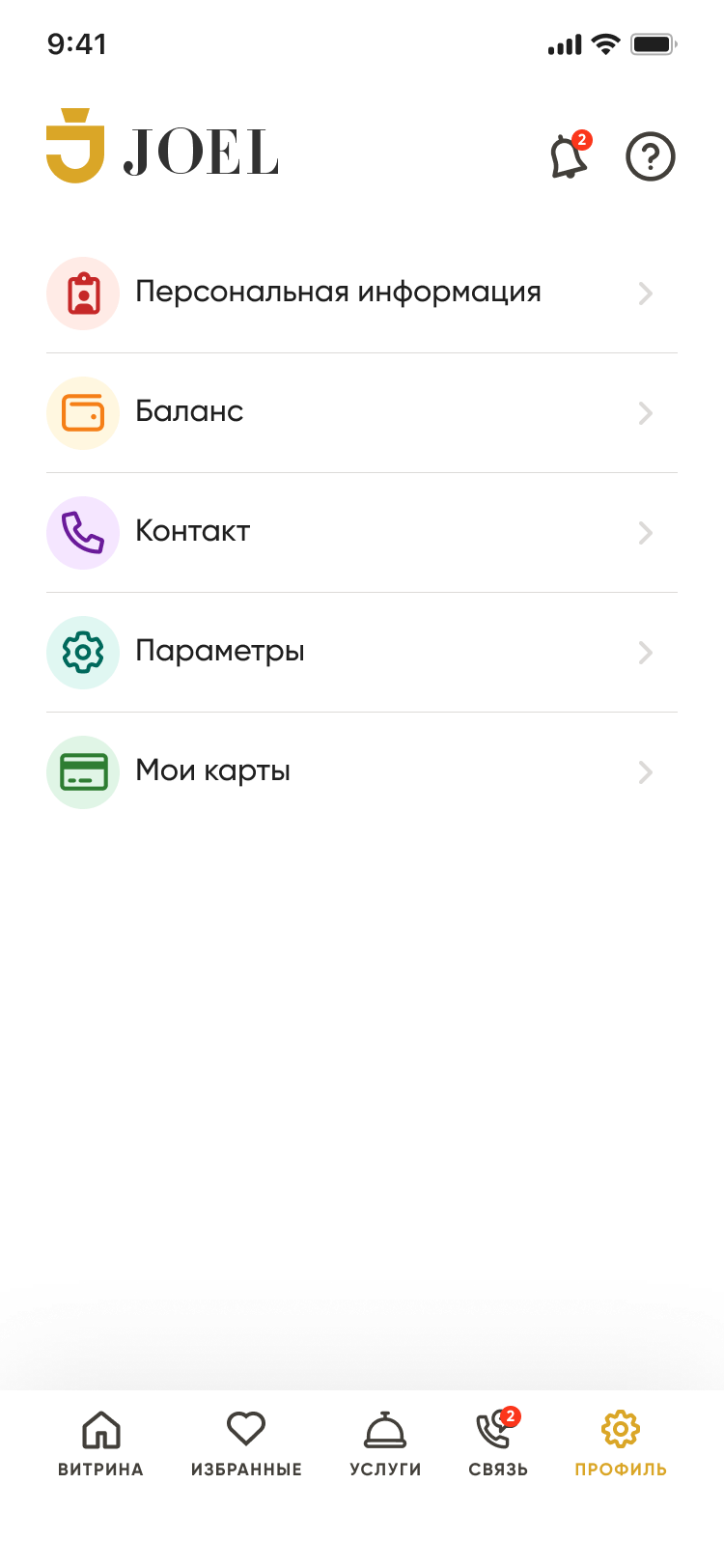
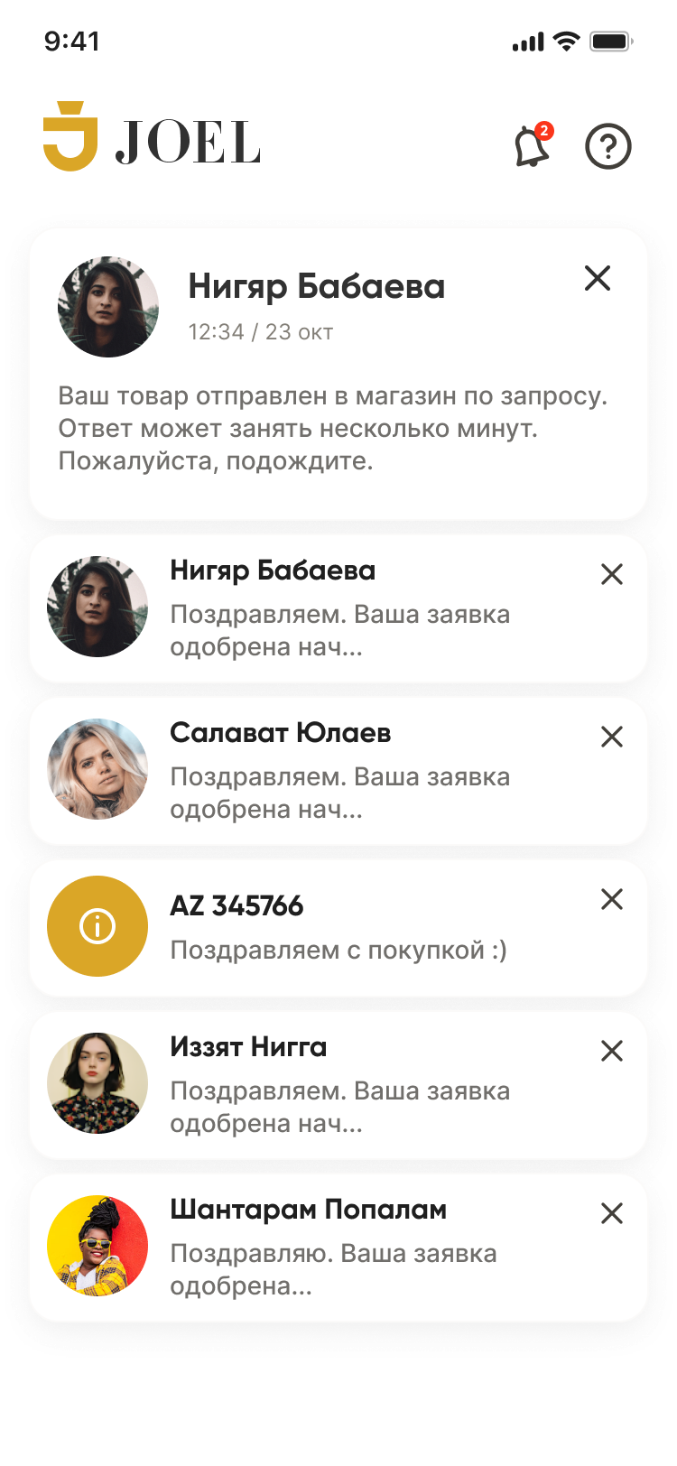
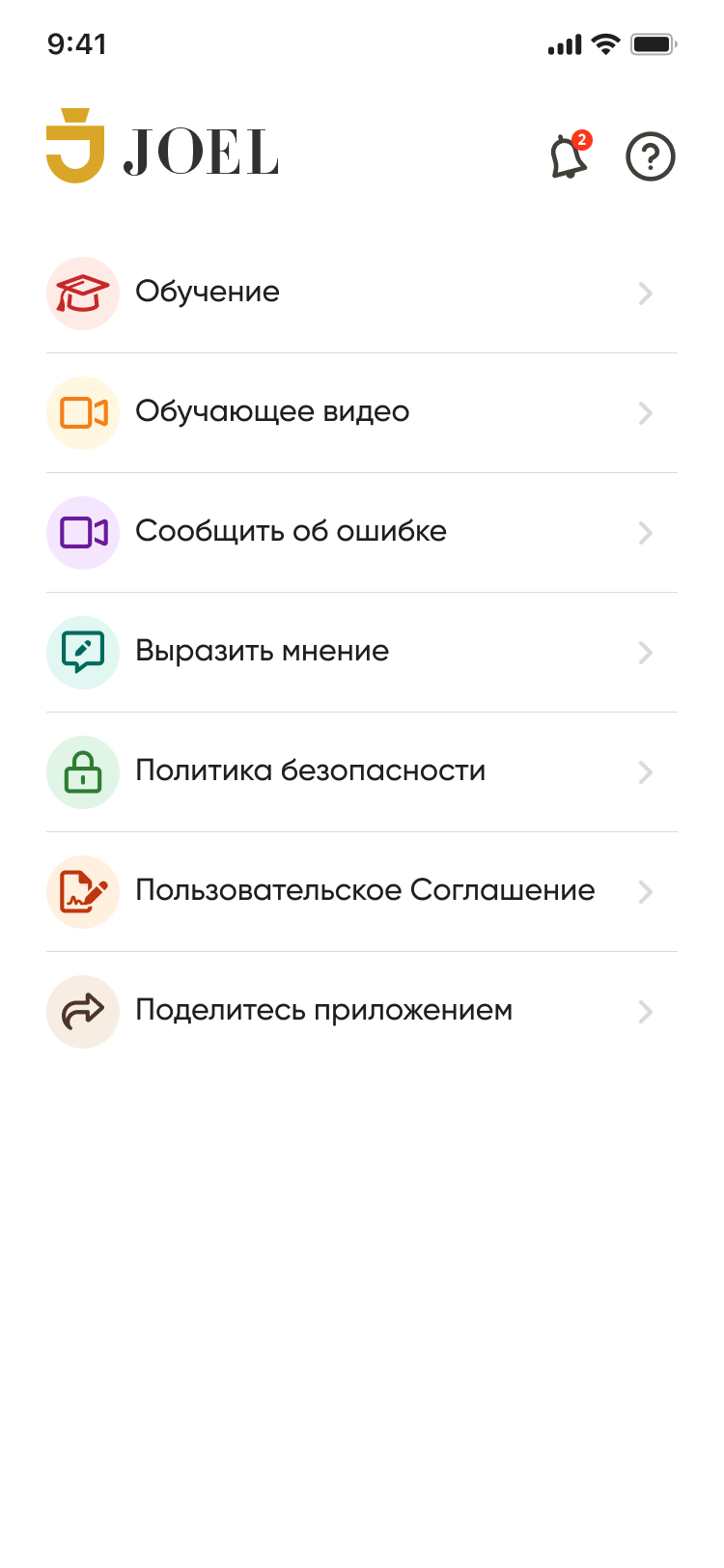
Buyer, jeweler, lombard, handmade seller, admin — each gets its own tailored surface, all sharing one design language.
Not just screens
I owned product design end-to-end — and a good deal beyond it. From the first flow to the last pixel, the small team around it, the brand, the conversations with the business, and the testing that proved it worked.
A custom set of 30+ marks — started from Feather Icons, then reworked into a duotone, custom-weight family and animated into looping pictograms for empty states, onboarding and brand moments.
Color, type, components and 32 card states — built once, reused across web, tablet and the mobile apps so every role looks like the same product.
Palette
Typography
Didot sets the jewelry-grade headlines; Gilroy carries every interface label and table. Neither is a web font, so this specimen is set in the case page's own type.
Buttons
Inputs
Search by stone, carat…Metal · Gold 585Price, ₼Status badges
Four statuses — three ribbons and an empty one — drive the entire 32-variant shop-card matrix. How that matrix is built →
Shop card · live variants
Shops, lombards, buyers and handmade sellers are listed on the same row. One component carries all four — and the library records exactly what that cost.
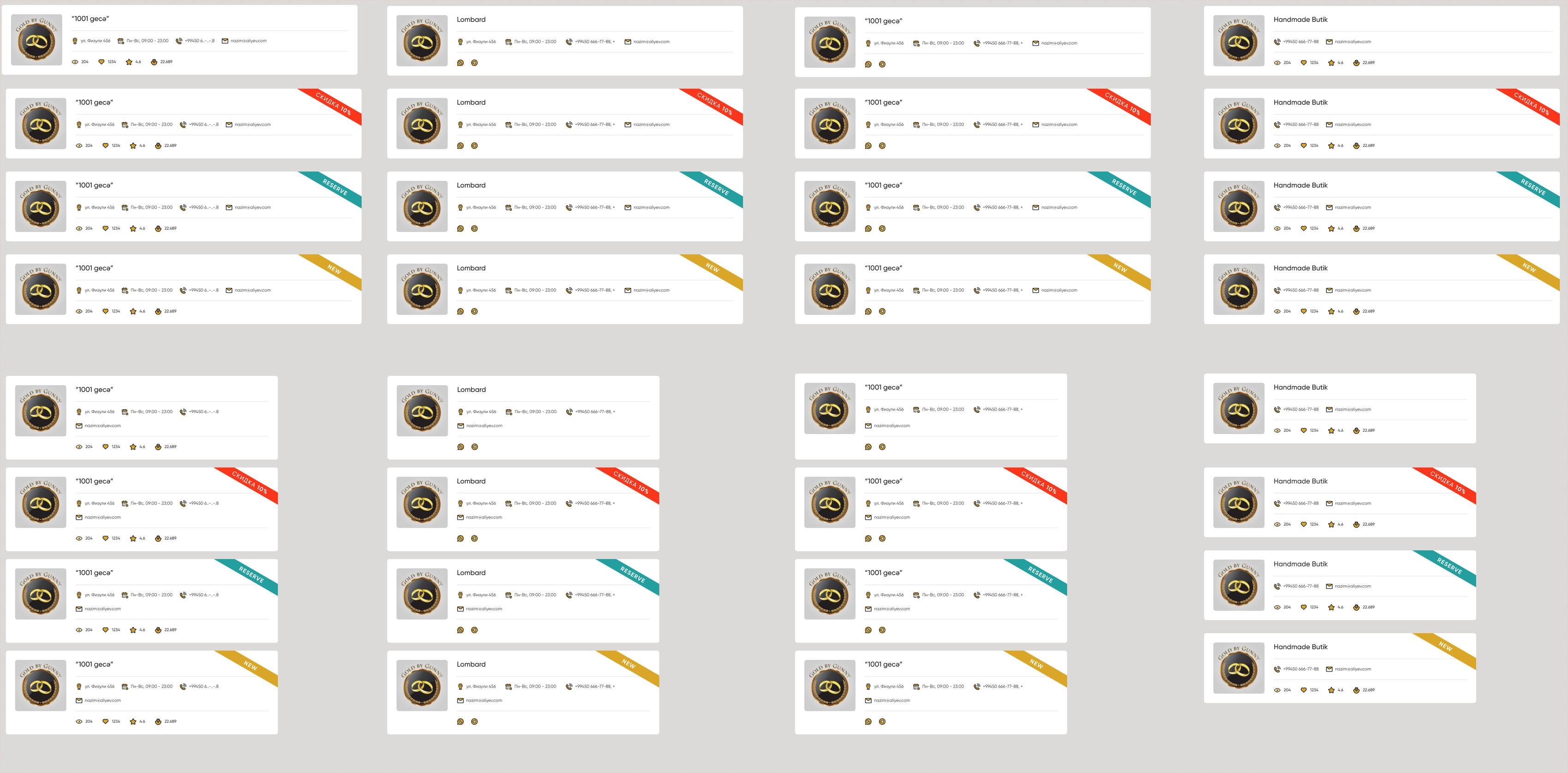
Four types × four statuses × two breakpoints
Not a list of 32 screenshots — the axes themselves. Every cell is a real variant in the library and the number is its measured height in Figma, which is where the matrix starts telling on itself.
Desktop · 1224 px wide
iPad · 936 px wide
Why it is 32 and not 8
The same file holds two cards built on opposite principles. Putting them side by side is the whole argument.
Shop card · every axis is a variant
- Variant axes
- Type ×4 · Status ×4 · Size ×2
- Combinations drawn
- 32 of 32
- Component properties
- none
- Cost of a fifth status
- 8 new variants, by hand
Product card · the other approach, same library
- Variant axes
- state ×6 · hover ×2
- Combinations drawn
- 6 of 12 — hover exists only where hover means something
- Component properties
- 5 booleans — promo, price, sales, carousel 3, carousel 4
- Cost of a fifth toggle
- one boolean
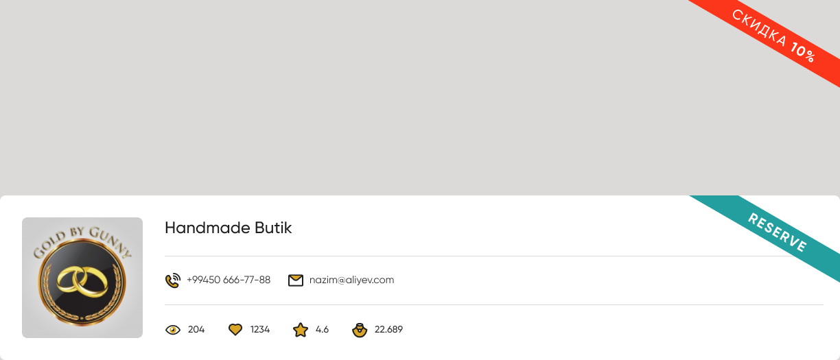
The status ribbon was already its own component — Aksiya, four states including an empty one. The shop card never swaps it: a non-default variant carries all three ribbons stacked on top of each other with two switched off. Across the set that is 72 ribbon instances, 48 of them permanently invisible. Bound as an instance-swap property instead, Status leaves the axes altogether and the set becomes 4 types × 2 sizes — 8 variants instead of 32.
Type switches the data, not the layout
The skeleton never changes: a 176 px square, the name, a contact rail, a stats strip. Type decides which rails are filled.
| Type | Contact rail | Marketplace stats | Layers |
|---|---|---|---|
| Shop | address · hours · phone · mail | views · likes · rating · items | 110 |
| Handmade | phone · mail | views · likes · rating · items | 68 |
| Lombard | site · address · hours · two phones · mail · WhatsApp · Telegram | — | 96 |
| Buying | site · address · hours · two phones · mail · WhatsApp · Telegram | — | 96 |
A shop and a handmade seller trade on the platform, so they carry marketplace numbers. A lombard and a buyer are reached off the platform, so they carry messengers instead and no numbers at all. One skeleton, two data contracts — which is why Type earns its place as a variant and the other two axes do not. It was not always one card: the previous file carries three separate components for the same job — Shop card Vertical, Lombard card Vertical, Shopcard Lombard M — each drawn and maintained on its own. Folding them into a single Type axis is the move that turned a set of look-alike cards into one system component. In the file the card is placed 15 times across five surfaces: the buyer’s four directory pages — Shop, Lombard, Buying, Handmade — and the jeweller’s Services desk.
Everything sits on one line, and the line has to survive 1224 → 936
The card is a single horizontal row. On iPad it loses 288 px of width with nothing allowed to drop out of it — for a lombard listing those contact routes are the entire product.
The contact rail is an auto-layout row, so at 936 px it wraps onto a second line and the card grows from 240 to 288 px instead of truncating. Nothing is hidden and all seven routes stay reachable. Handmade stays at 240 because it only ever carries two. That part works — the cost was paying for it with a third variant axis.
What that cost, found by auditing the set rather than looking at it:
- Buying / Default / iPad is 296 px — 8 px taller than its own three siblings, with identical content.
- Handmade / Sale shows no ribbon at all, though it is the Sale variant.
- Handmade / Reserve carries a second, stray ribbon parked 285 px above the card, outside its own bounds.
Two of 32 are wrong, and the matrix view cannot tell you — the stray sits in the gutter between rows, where it reads as part of the layout.
Three moves, 32 down to 4
- Status → instance swap of the ribbon component that already exists. 32 → 8.
- Size → one auto-layout card with a min width, no breakpoint axis. 8 → 4.
- Type stays the only variant, because it is the only axis that changes the data contract rather than the styling.
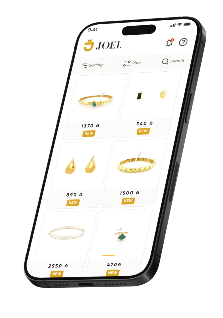
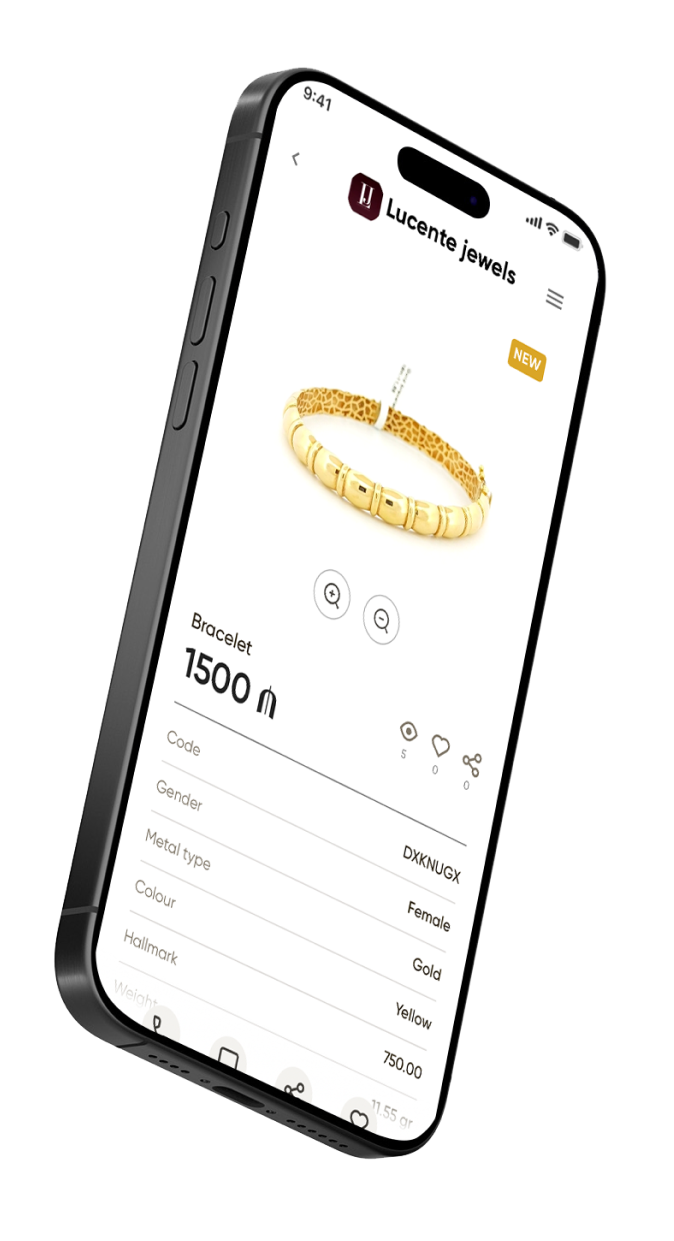
A public storefront spanning 2,000+ ateliers — real images, certificates and live pricing, so browsing rare jewelry feels like a showroom, not a classifieds page.
Two sides, two minds
The marketplace only works if both ends win. The whole design is anchored to these two people and what keeps them up at night.
Goals
- Find certified, authentic pieces
- Compare price & quality fairly
- Reserve before visiting a shop
Pains
- Fear of fakes & no certificate
- Opaque, “ask in DM” pricing
- Driving store to store
Wants
- Real photos & 360° views
- Transparent, final prices
- Card-installment options
Context
- Shops on mobile, evenings
- Buys for events & herself
- Trusts reviews & badges
Goals
- List stock online quickly
- Reach buyers beyond the street
- Handle buy-back & credit cleanly
Pains
- Paper ledgers & manual entry
- No single view of the till
- Slow to publish a new item
Wants
- One cash desk for everything
- Fast add-product flow
- Reports & control from the phone
Context
- Behind the counter all day
- Staff with mixed tech skill
- Cash, card & installments
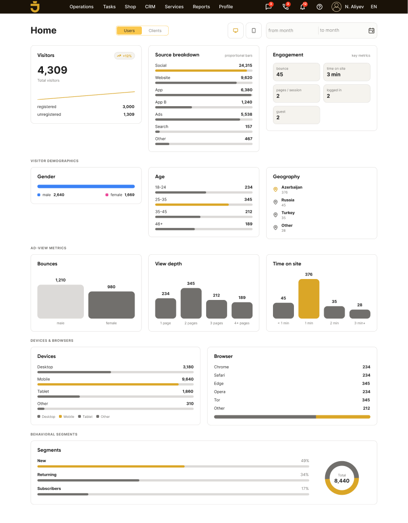
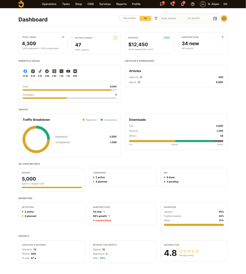
Dashboards
- Tools for business development
- Tools for analysis
Bundle rings, chains and stones into a set — with partial-set and discount pricing handled by page, not seller.


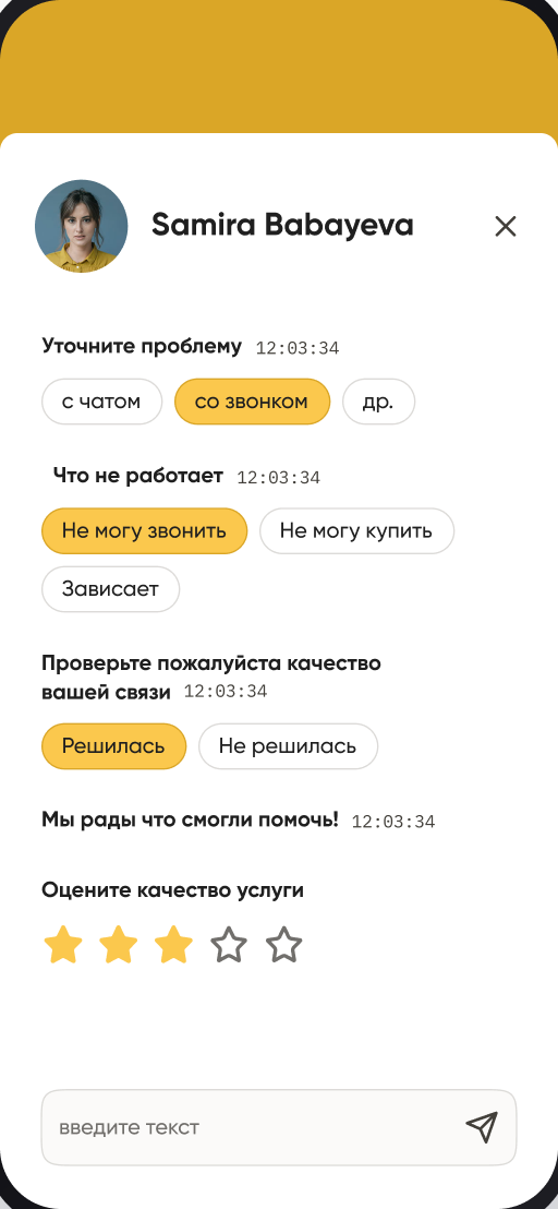
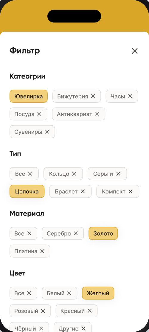
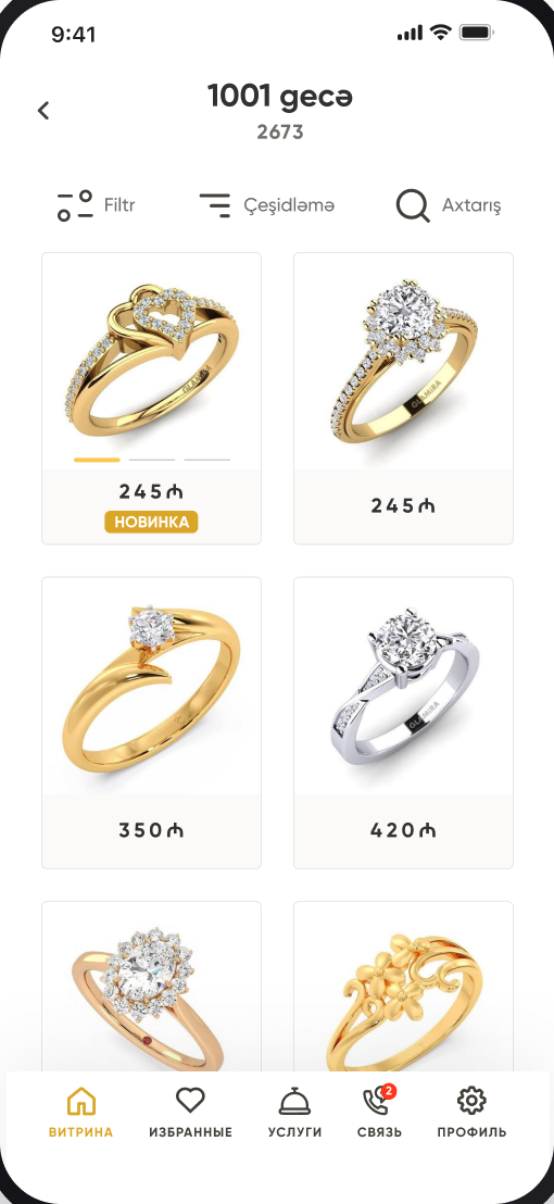
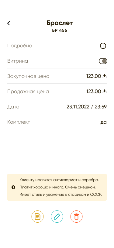
The buyer's path, end to end
Where the emotion dips is where the design earns its keep — every low point maps to a concrete opportunity that shipped.
The app, mapped
Five roles branch from one core, each carrying the handful of screens that role lives in — all sitting on one shared design system.
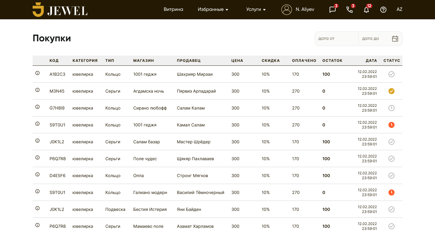
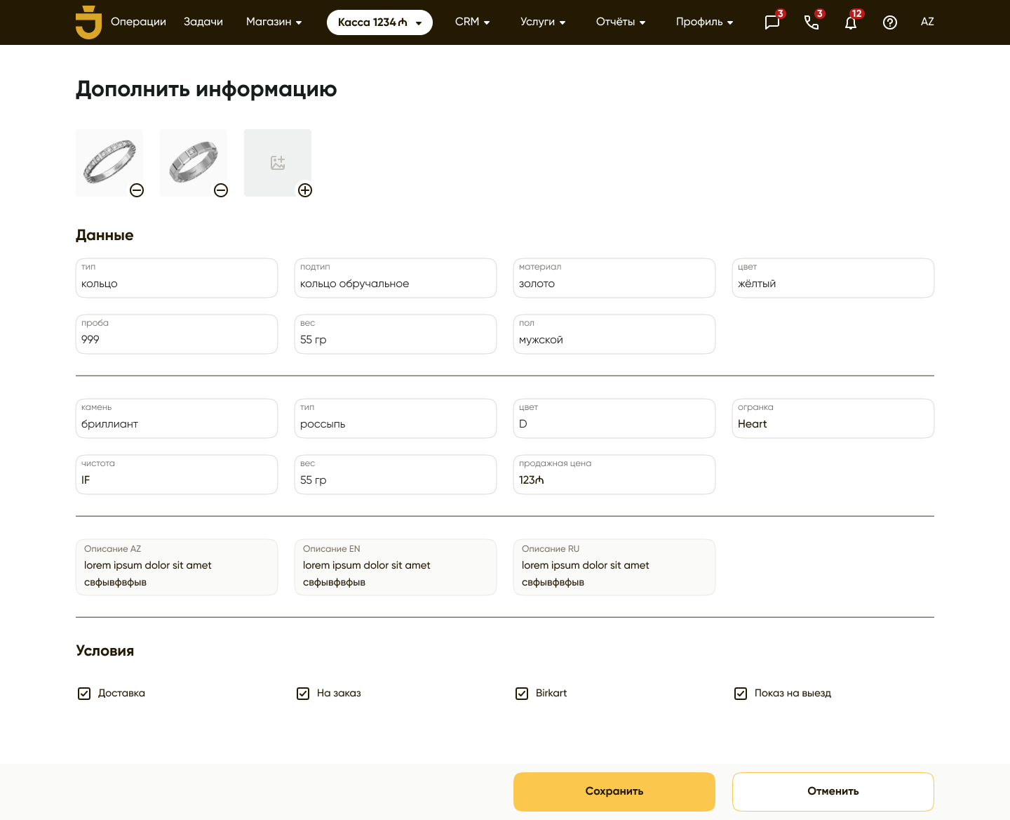
Sales, buy-back, credit and stock — one operational surface a jeweler runs the whole counter from.
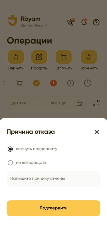
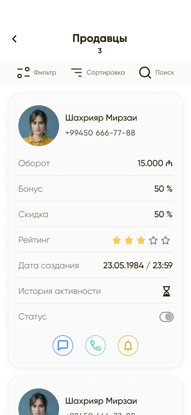
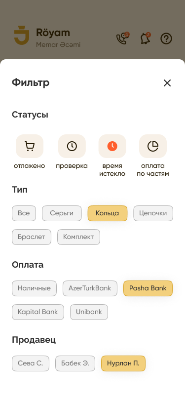
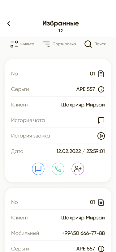
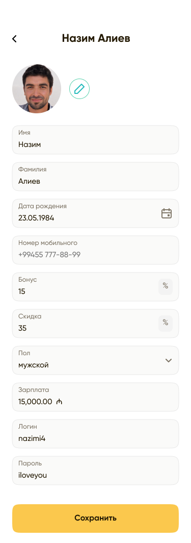
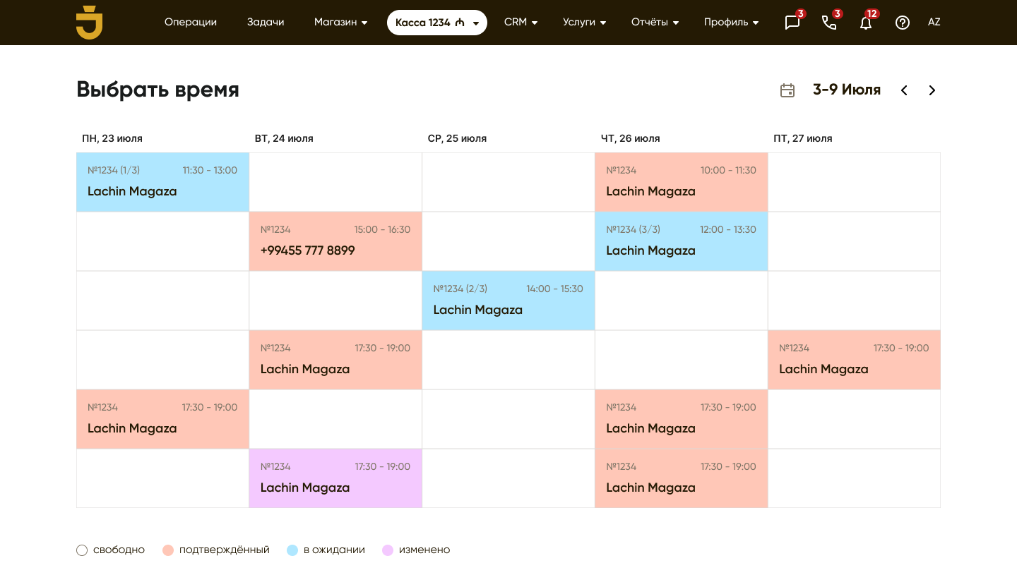
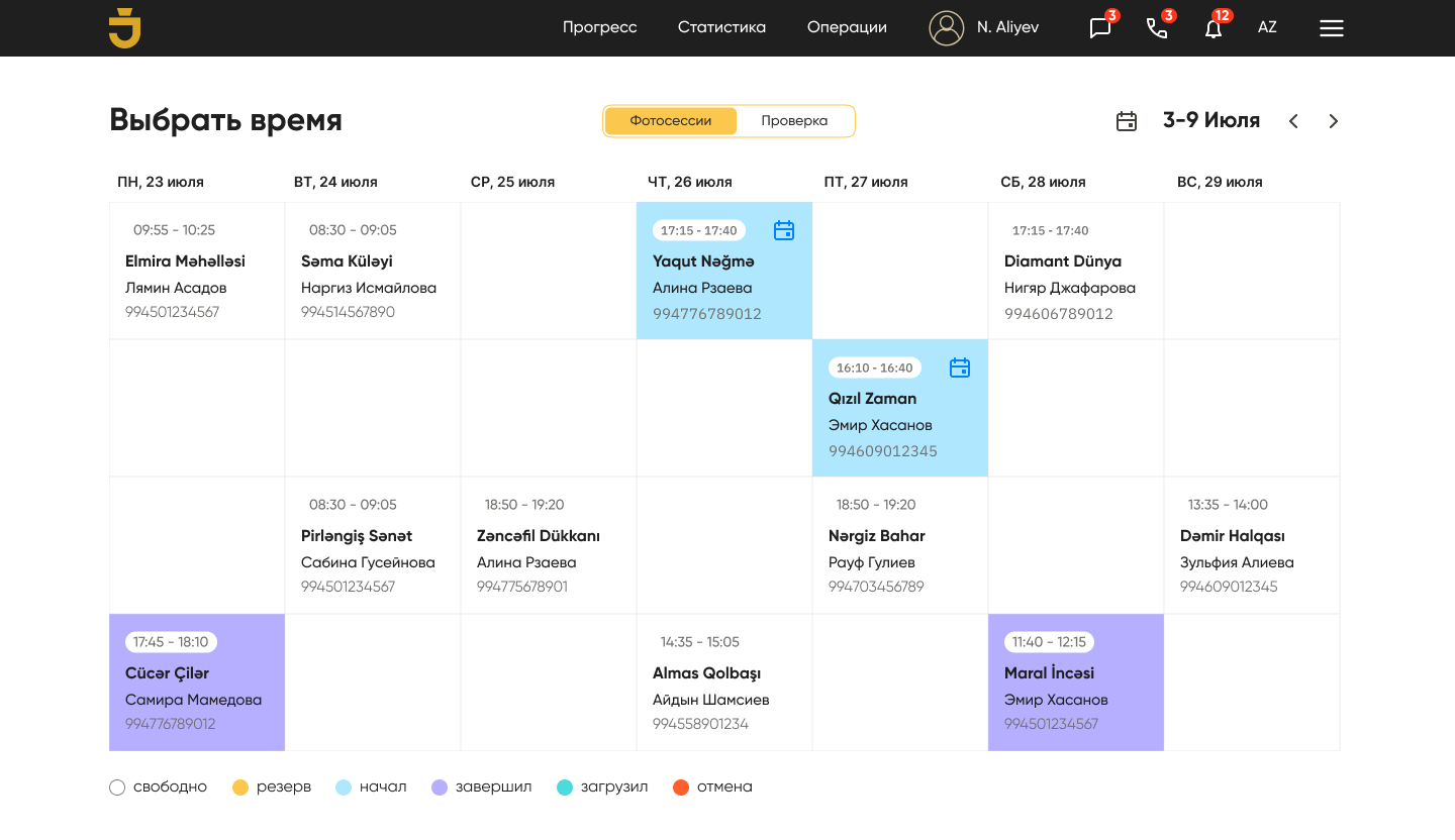
Operational control
Tasks, photo-sessions and the production pipeline — scheduled and assignable from one board.
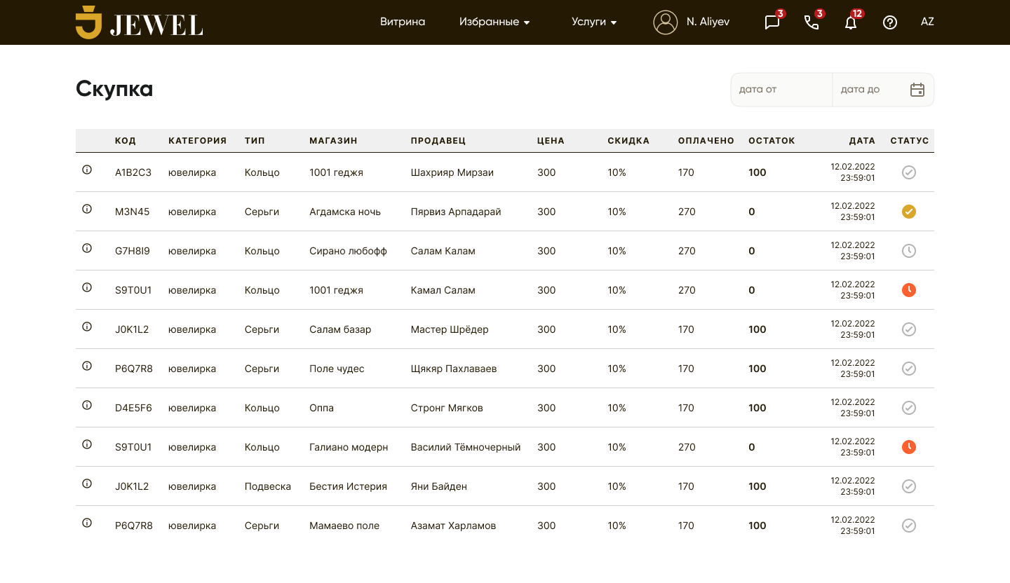
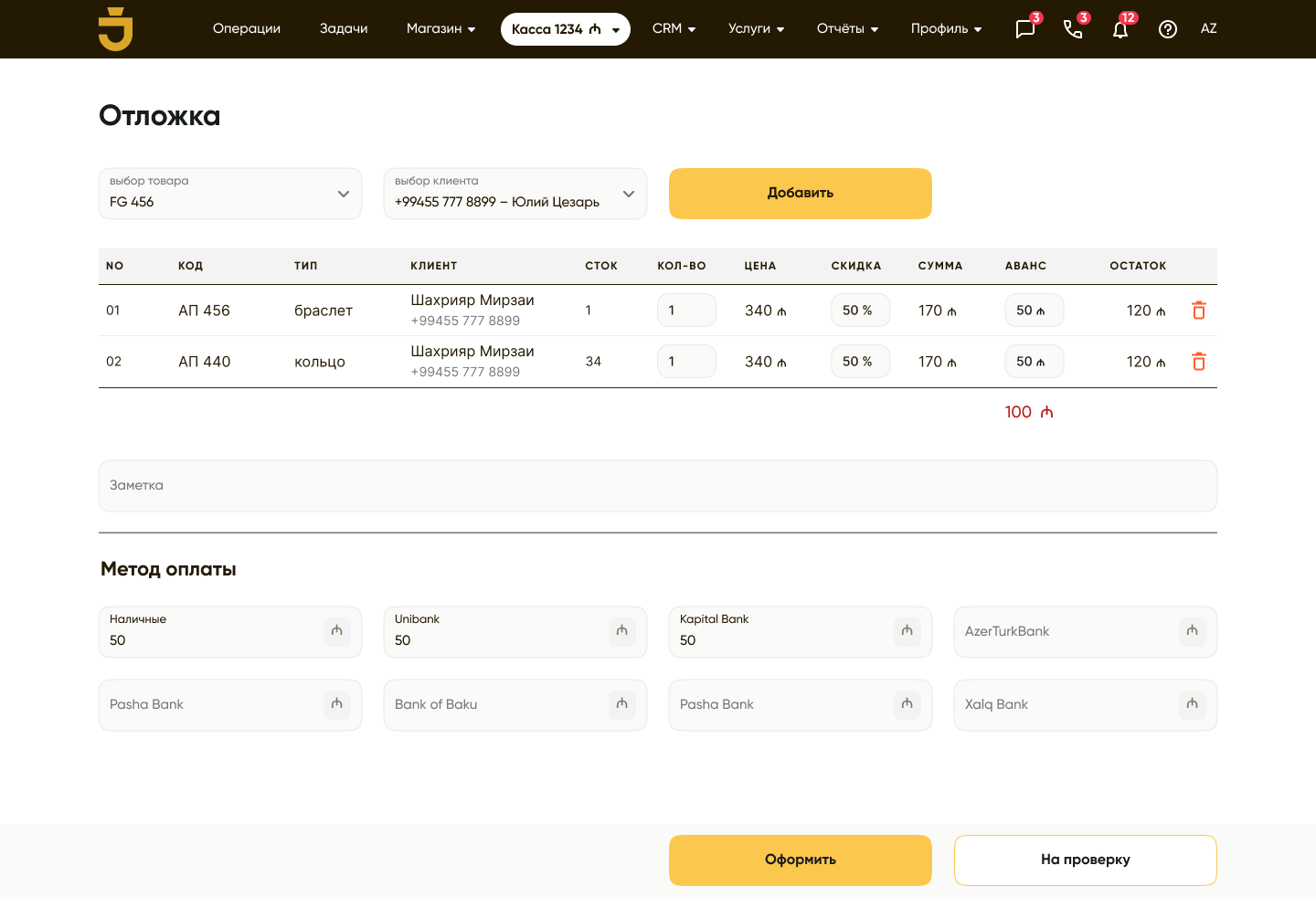
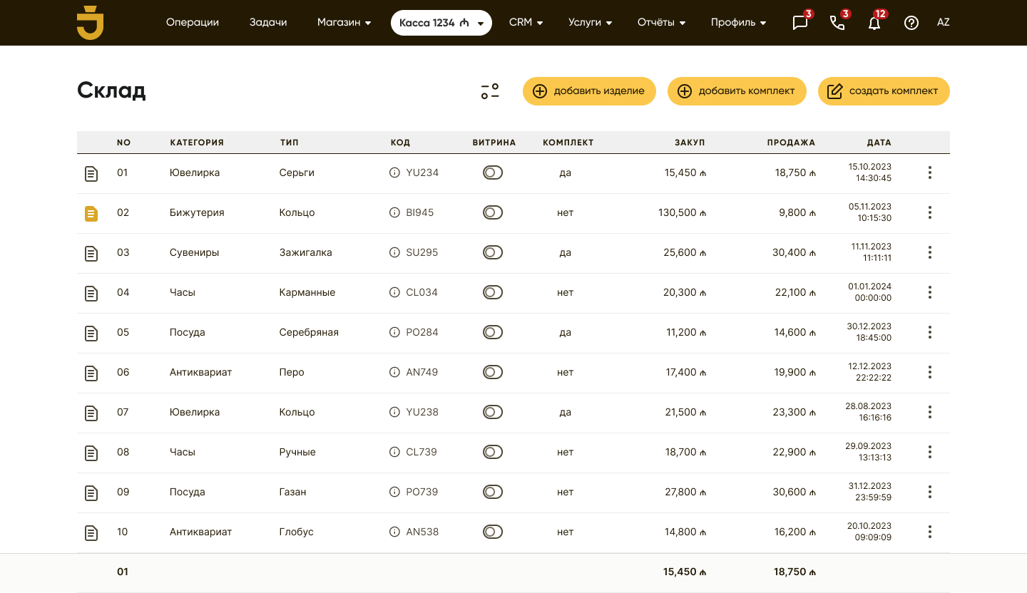
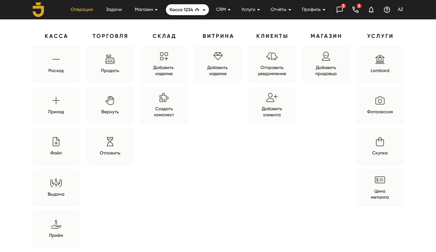
A toolkit for every side
- Jeweler
- Lombard
- Buyer
- Content creator
- Manager
- …and more
Clients, stock, reports and buy-back, credit & photo-session requests — the jeweler's entire operation, mobile-first.