 CITAMEYA
Booking for people who work with their hands
A hairdresser in Madrid runs her week from a paper notebook. Citameya turns that into a link she sends once — and, when her hands are busy, a sentence she says out loud.
What shipped · 29 Apr → 23 Jul 2026
Three months, one person, one product.
01 Landing
Sell it to someone who has never booked online
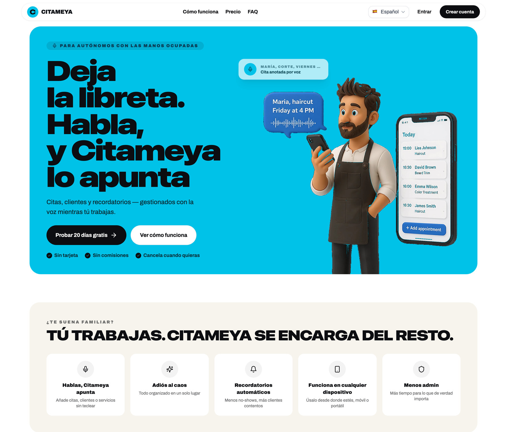
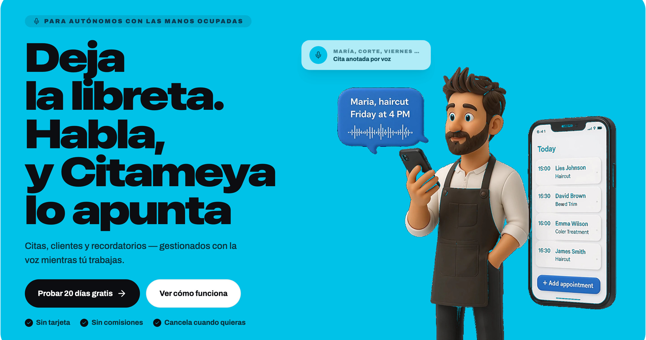
The audience is not a salon chain with an office manager. It is one self-employed person, mid-haircut, being asked to trust software with the thing that pays her rent. So the promise is the first line, in her words: «Deja la libreta. Habla, y Citameya lo apunta.» — drop the notebook, speak, and Citameya writes it down.

02 Voice booking
Say it while your hands are busy
A form is the wrong interface for someone holding scissors. So you talk, and the fields fill themselves as you speak — one chip at a time, each tappable if the machine got it wrong. It runs on every public booking page, and this is the reason the product has the shape it has.
Phrases arrive as they are spoken. Nothing has left the device but text.
The running transcript is matched against this master’s own service list, once every three seconds.
Service, date, time, name, phone. Tap one to correct it and your edit is locked against later passes.
The recording gets a final, slower transcription that merges with your corrections instead of overwriting them.
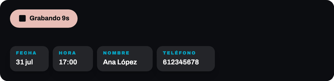
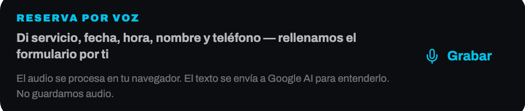
Shipped as an experiment, not as an opinion
Live captioning could just as easily be noise — a row of chips jittering while somebody is trying to talk. So it went out as a real 50/50 split in PostHog, measured on a funnel from first tap to a booking actually created by voice, with iOS and Firefox excluded because they have no Web Speech to stream.
The experiment decides whether it stays. That is the point of building it behind a flag instead of shipping it because it demos well.
03 Booking page
The whole product is one link
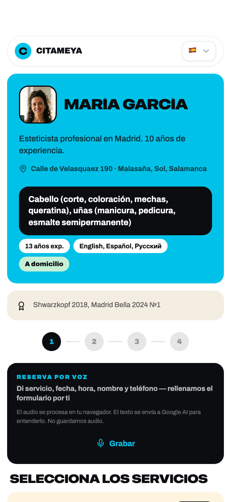
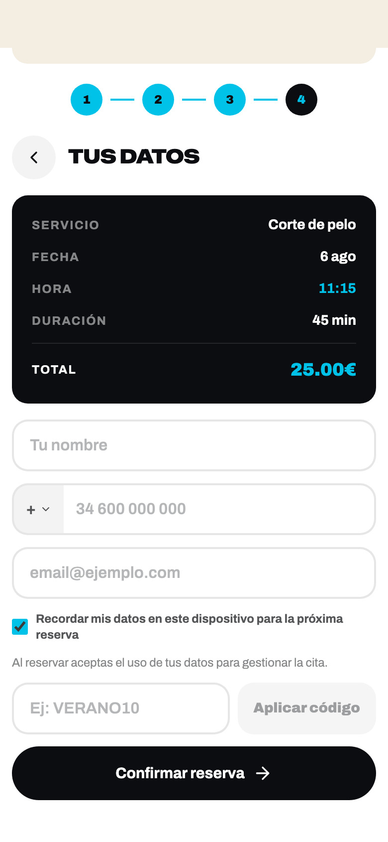
citameya.com/maria-garcia — four steps, no account, no app. Services, day, time, details — with price and duration visible before the first tap, because the only questions a client really has are what it costs and how long she is there.
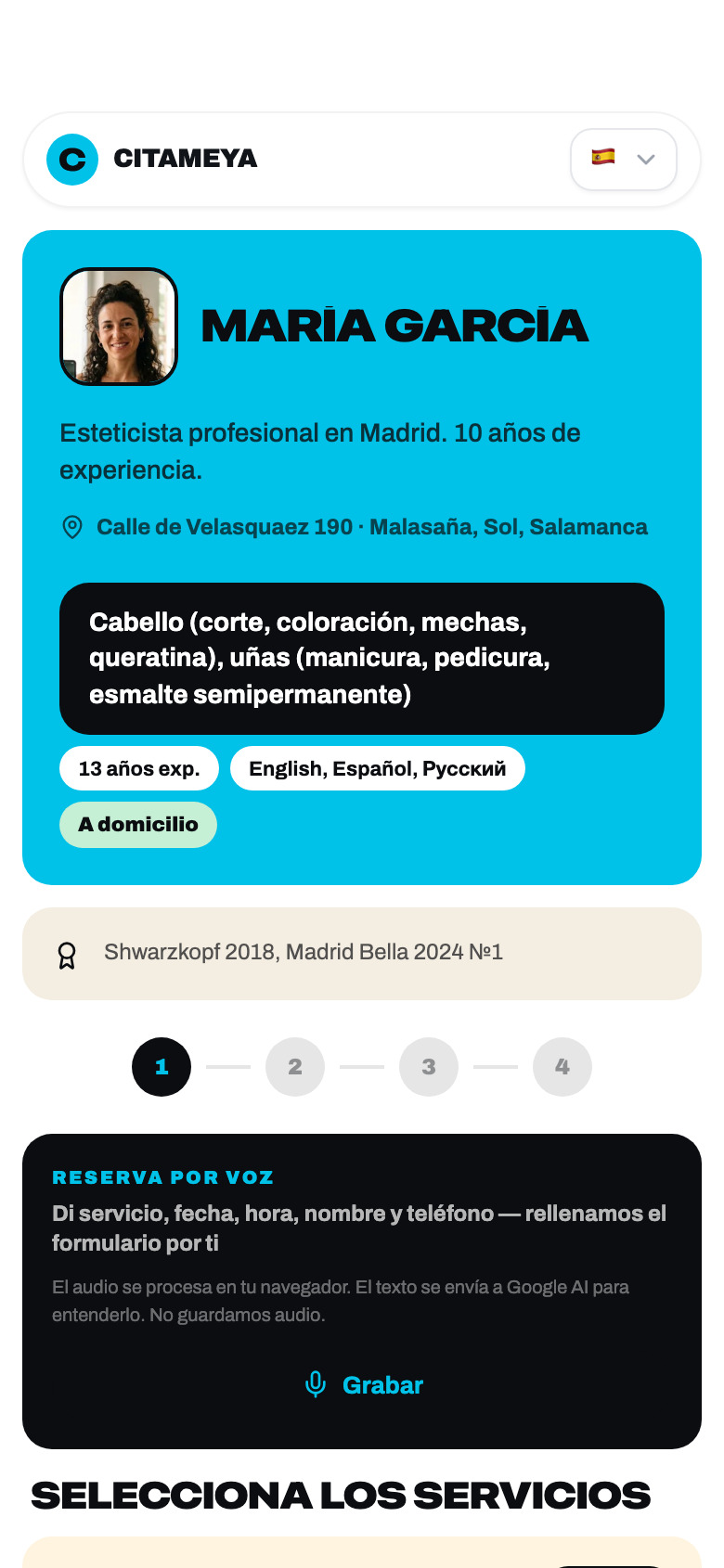
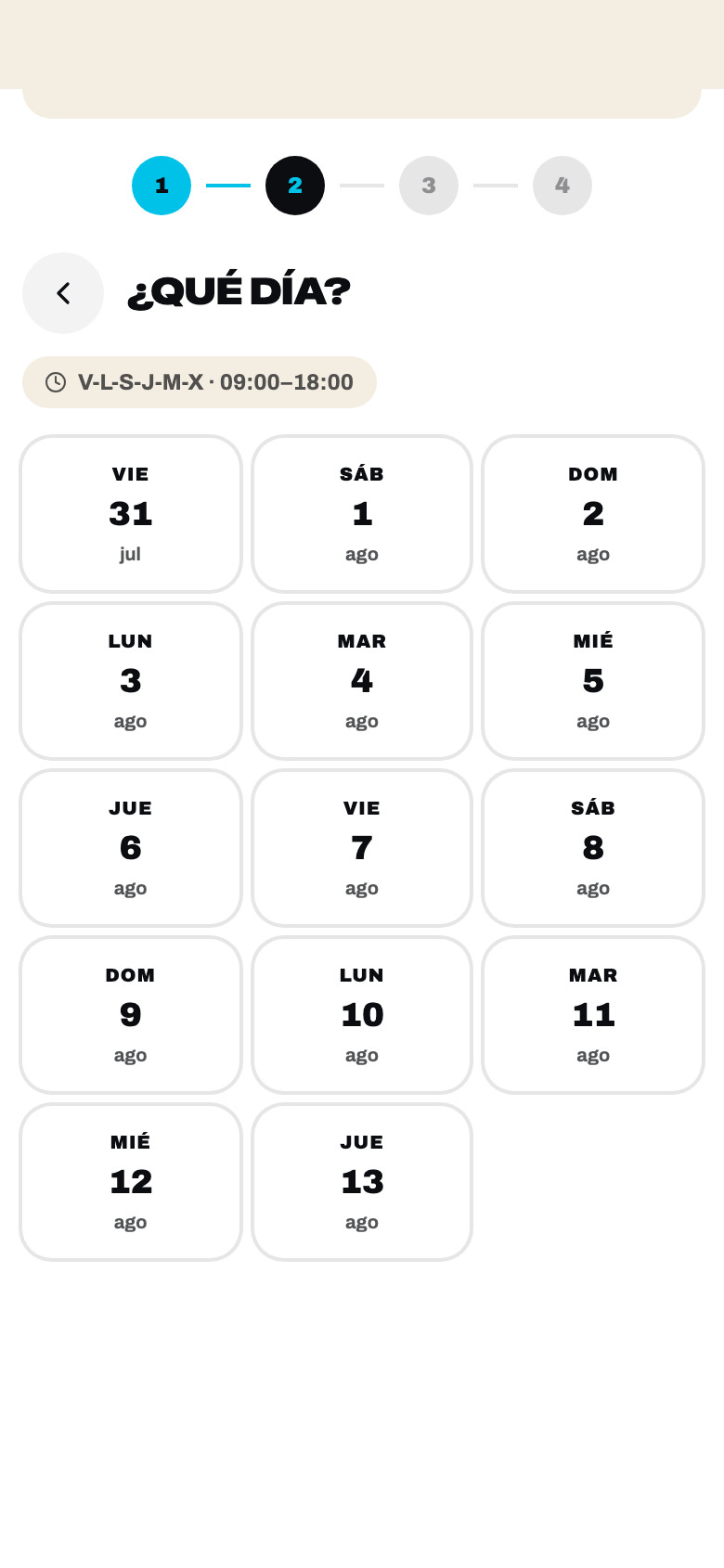
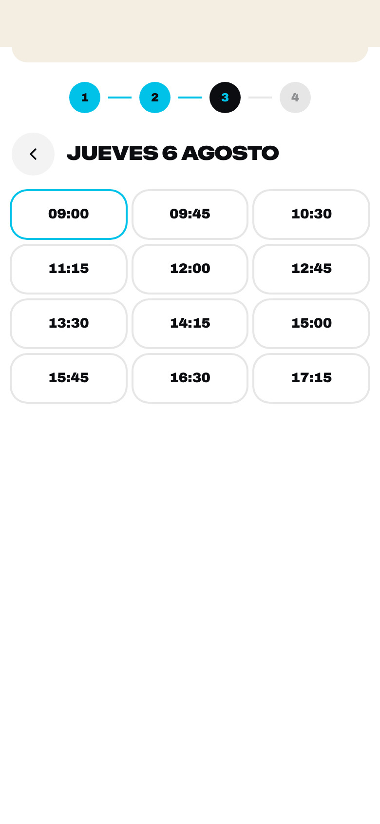
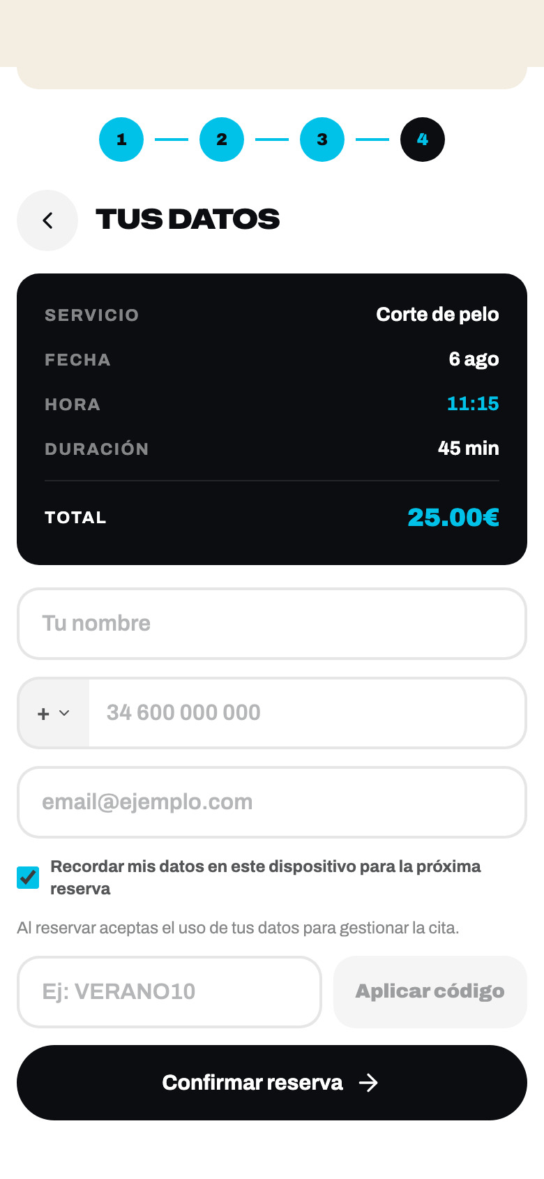
Colour is doing work here
Each service row carries its own pastel. Not decoration: on a page with eight services, the tint is what a returning client scans for instead of reading the list again. The price pill is always the same shape, in the same place.
The name on the row resolves through a 191-entry catalogue at render time, in the language of whoever is looking — not the language the master typed it in.

No calls.
No DMs.
One link.
as it runs on the landing: «Deja la libreta. Habla, y Citameya lo apunta.»
04 The master’s day
The screen she opens with wet hands
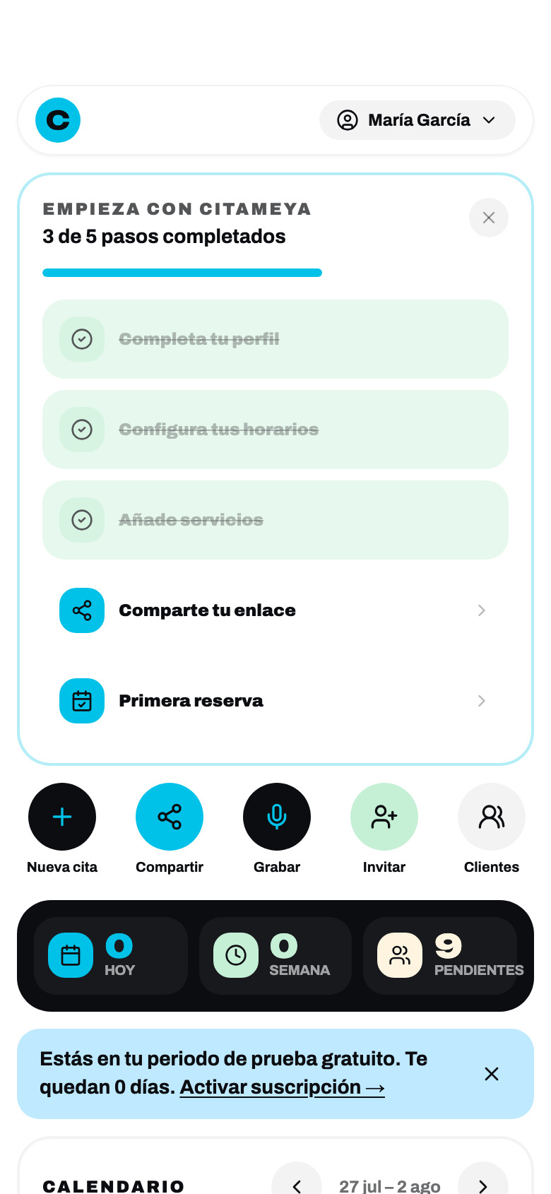
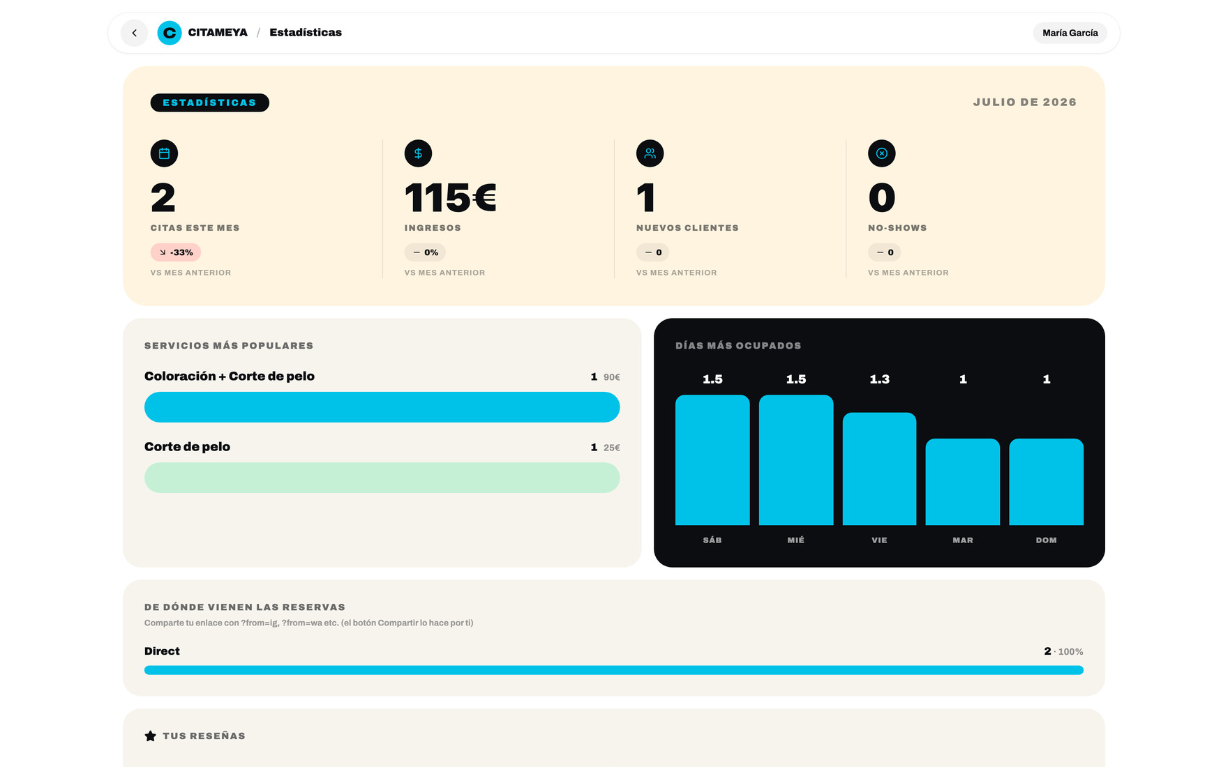
The client’s side is four steps and then it is over. This is the side she opens between two clients to answer one question: what is next. So the day is the default view, the week is one tap away, and every action she actually performs is a single round button at the top.
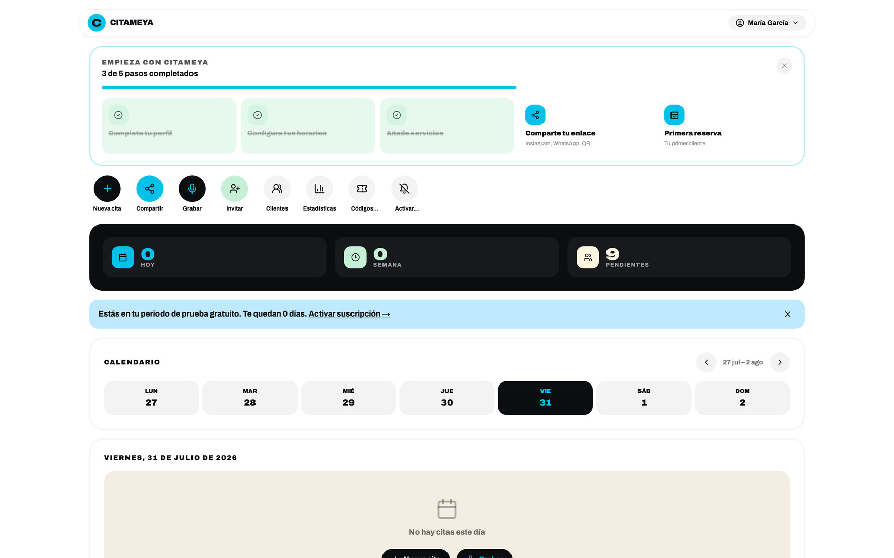
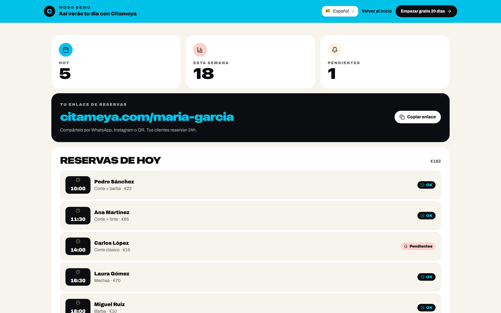
Before the day exists, there is the setup
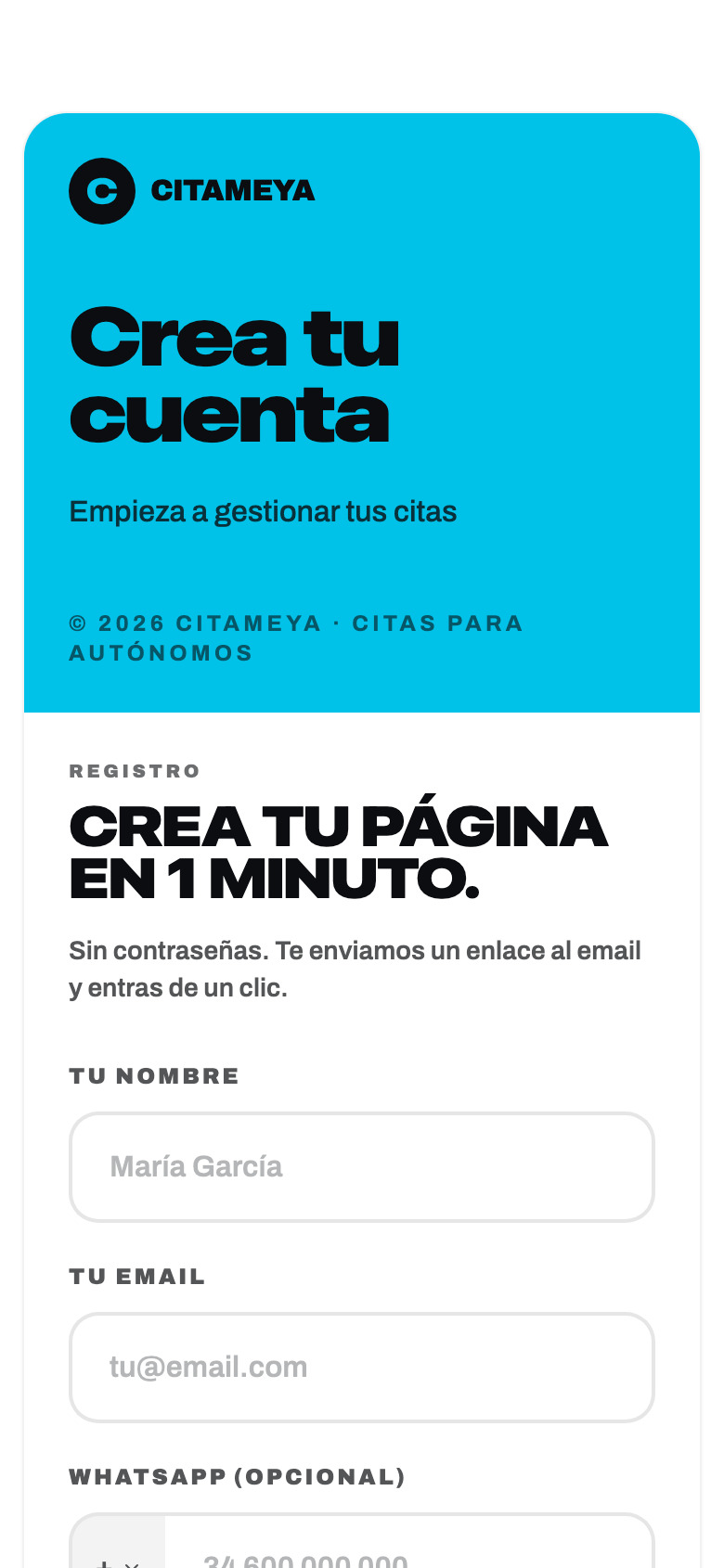
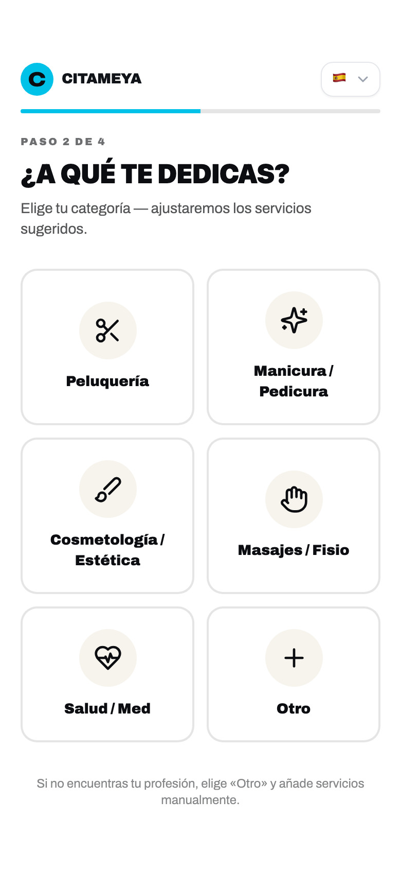
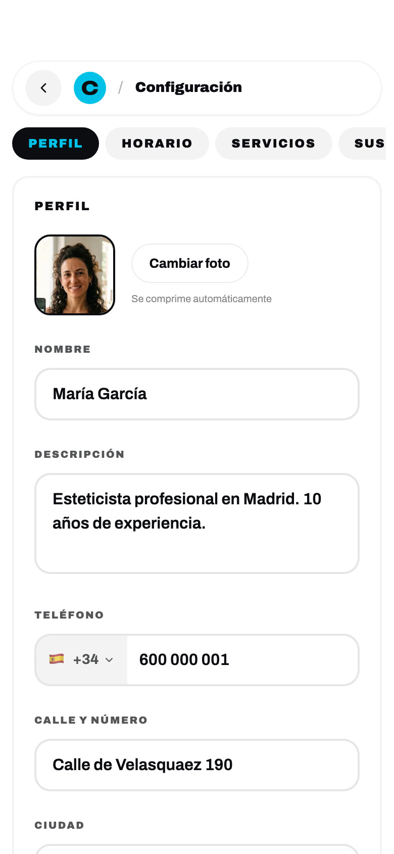
Asking a hairdresser to type out thirty services with prices and durations is where onboarding dies. So the first question is only «¿A qué te dedicas?» — and answering it loads a slice of a 191-entry catalogue, already translated, with default durations she can correct. Three steps and the public page exists: no sales call, no import, no card.
The magic link goes out over WhatsApp as well as email, because this audience lives there and forgets passwords.
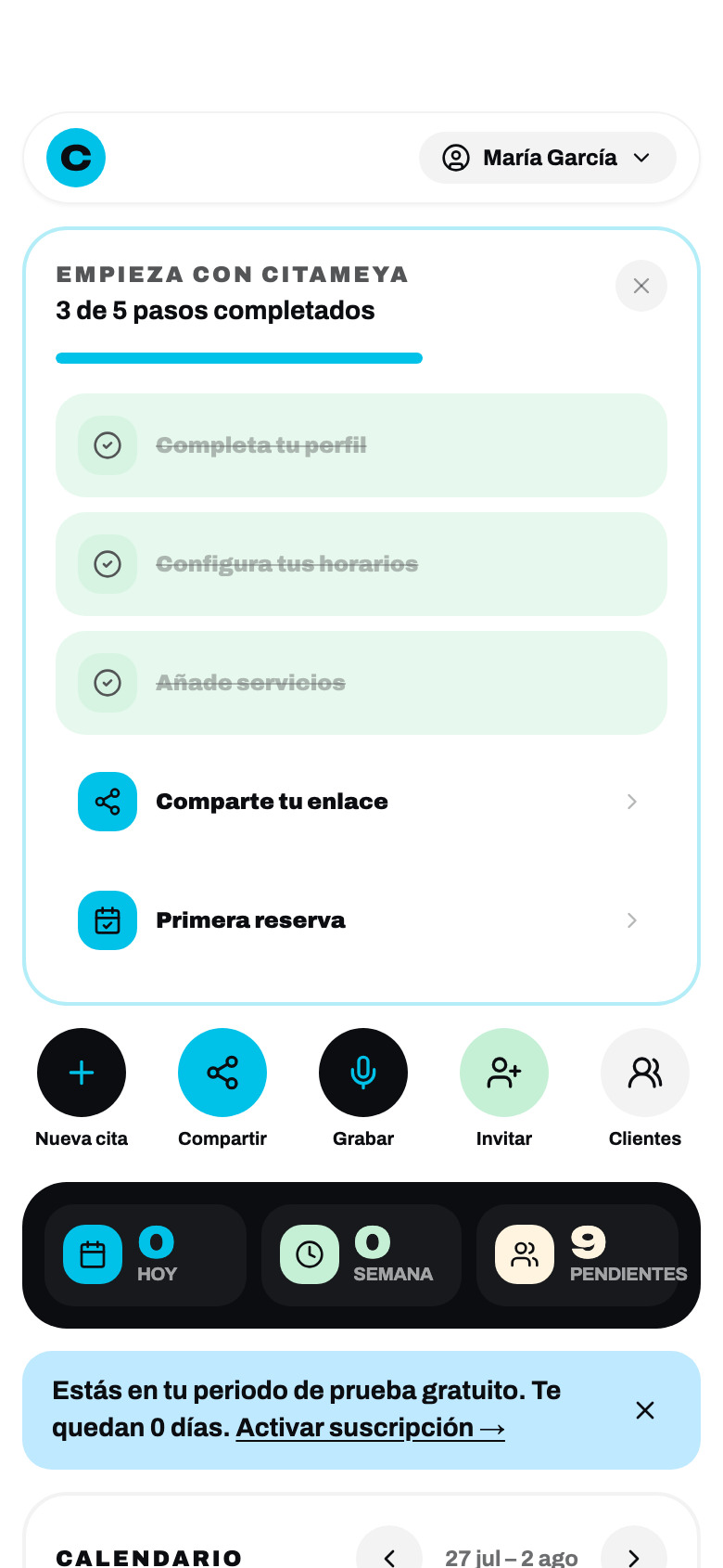

Distribution was a design problem, not a marketing one. The product cannot make her post on Instagram — but it can hand her a finished Story with today’s free slots already in it.
Creating a booking used to leave her looking at the wrong day. Now the view jumps to the date she just booked. That bug was invisible until you used the thing for a week.
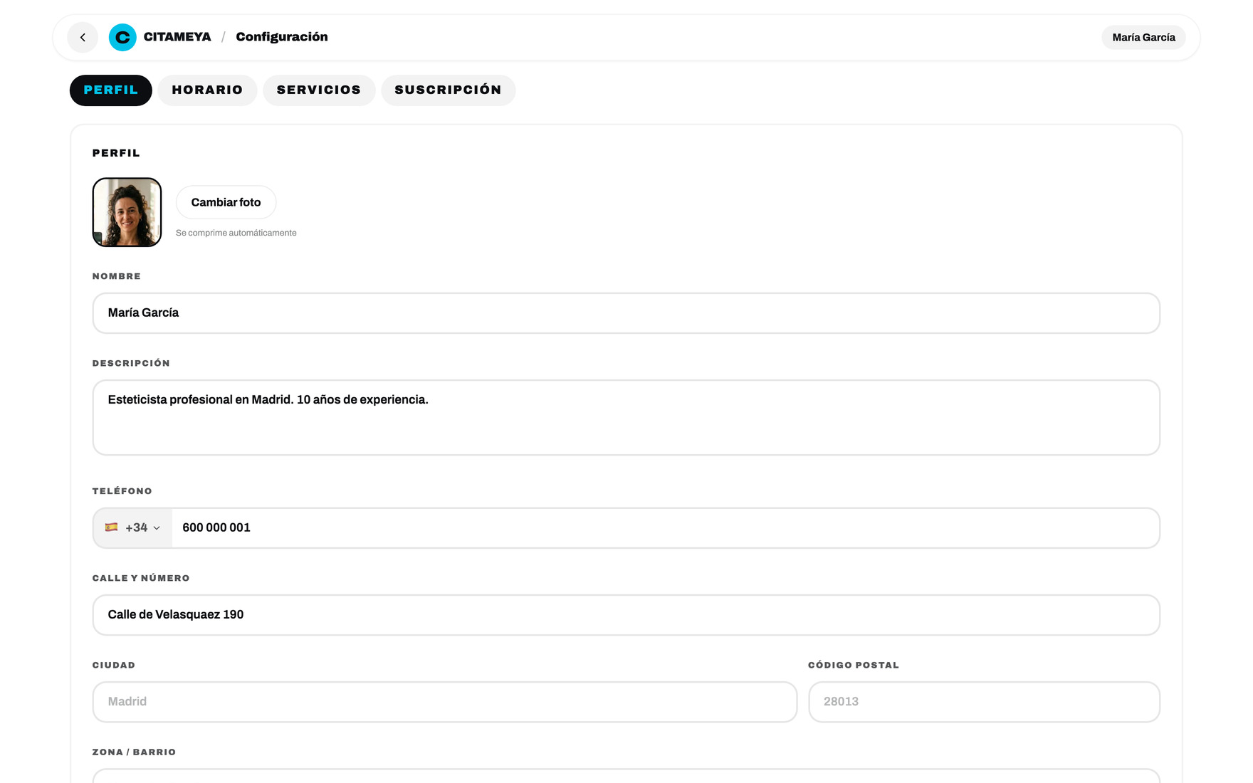
Blocking time off needed its own calendar: a native date input cannot grey out days that are already taken, so she could only find out by getting an error.
05 Trust & no-shows
Everything here exists to stop an empty chair
A missed appointment is not an inconvenience for a self-employed hairdresser. It is an hour of income that does not come back. Four features, one job.
A deposit, when she wants one
Stripe takes a deposit up front on the services where a no-show hurts most. Per-master and off by default — charging a regular for a €15 beard trim is a good way to lose her.
Cancel by link
Every confirmation carries a tokenised cancel link. Letting a client cancel in one tap sounds like a loss; it is how the slot gets back on the market while it can still be sold.
A waiting list on a full day
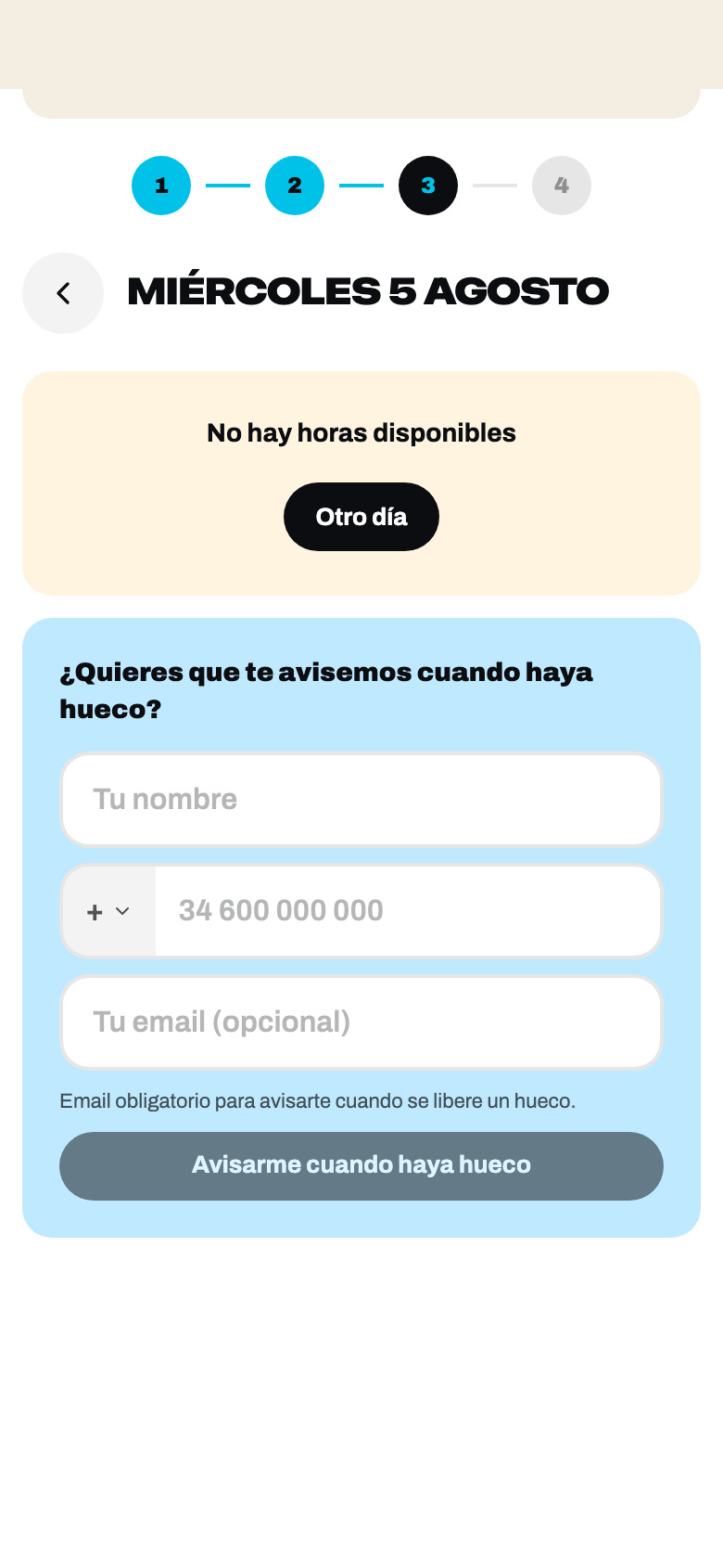
A sold-out day used to be a dead end. Now it collects a name, a phone and a language — and when a cancellation frees the slot, that list hears about it first.
Reviews nobody invented
The scheduler that sends the reminder also asks for the review, and it lands on the page the next client reads. If nobody has reviewed, nothing is shown — there is no score to fake.
06 Notifications
The product also lives in WhatsApp
Nobody in this market opens a dashboard to learn that a booking arrived. WhatsApp, email and web push carry the product to people who never log in — and each message is written in the language of whoever receives it, which is not the same as the language of whoever caused it.
Templates, master-facing and client-facing
Ten scheduled jobs, all on Madrid time
07:30 the day’s bookings, before she opens
11:00 a nudge to try dictating one
10:00 forty-eight hours with no bookings — something is wrong
10:15 trial ends in two days
hourly registered, never shared the link
Language is stored per person, not per account: the master has a notify_lang, and every booking snapshots what the client was reading when she made it. One row in the database, two languages out.
07 Design system
One set of values, two places it has to be true
A booking page a client opens once and a dashboard a hairdresser lives in every day are the same product, and they have to read like it. What holds them together is not a component library — it is a set of values that has to be true in two places at once: the Figma variables the screens are drawn from, and the CSS tokens the app ships. This chapter is what that set contains, how a change moves through it, and where it still does not reach.
Tokens — a palette first, then roles
The palette was never the problem. Cyan, ink and four warm accents were right from the first screen. The problem was that they lived as hex literals in the markup: #0b0d10 is written 1 179 times in the app, #00c2e8 246 times, eighty distinct values in all, none of them under a name. Figma had a token collection. The code had the values. Neither knew about the other.
The layer that closes that is two levels deep, and the split is the whole point. Primitives are the palette and know nothing about roles — ink-900, blue-500, cream-100. Semantics are the roles and hold no value of their own — surface-invert, fill-brand, text-on-invert. A role can only point at a primitive, never at a hex. That is what makes a rename cheap and a repaint safe.
Figma · collection “Citameya / Tokens”
- primitive/*21 colours
- color/text · bg · border11 roles
- color/accent · brand10 roles
- color/semantic · channel4 roles
- spacing/1 … 2412 steps
- radius/sm … pill7 steps
65 variables, up from 39. All 25 semantic colours are aliases of a primitive — none of them carries a raw value any more. A junk collection with a single stray variable is gone.
Code · src/styles/tokens.css
Every token exists in two forms derived from one value: --x-c as “R G B” channels, which is what lets Tailwind build rgb(var(--x-c) / <alpha-value>) so an opacity modifier still works, and --x as a finished colour for plain CSS. Skipping the channel form is not a cosmetic choice: bg-cit-surface-invert/5 would emit no rule at all, and 554 places in the app carry an opacity modifier.
How far one edit travels — and how far it does not
Changing that one primitive moves four declarations in the built stylesheet. Four, not four hundred — because the 1 179 ink call sites are still literals in the markup. The layer is in place and the rails for the sweep are laid; the sweep itself would touch 29 screens and needs a release of its own, so it is listed as debt below rather than claimed as done. The two sides agree on the values, though: a script compares the 21 primitives in Figma against the 21 in CSS, and the drift is zero.
The palette rule is a number, not a preference
Cyan against white is 2.13:1. That single measurement is why the brand colour has two roles instead of one — fill-brand for anything it fills, and text-on-invert for the one case where it may be text, on ink, at 9.16:1. There is deliberately no role for cyan text on a light surface, and the rule is written into the variable descriptions in Figma so it travels with the file. Checked against the app: of 93 places that set cyan as a text colour, every one is either on ink or an icon, never body copy on white.
Components — what exists on each side
| Figma library | Shipped code | |
|---|---|---|
| Library | 9 component sets, 106 variants | 3 primitives in use (dialog, toast, toaster) + 18 product components |
| The button | Button — 45 variants | .pill — 3 tones × 3 sizes, ~337 uses |
| Theme reach | — | 29 of 29 screens carry it |
| Off the system | — | 169 raw <button>, 56 raw <input> |
| Removed | “Button 56” marked deprecated | 6 of 9 scaffolded primitives deleted — zero imports |
The scaffold that came with the starter kit had nine primitives in it. Three were ever imported. The other six — button, input, badge, card, label, separator — sat in the repository for months looking like a component library while every actual button on every actual screen was a <button> with a .pill class on it. Deleting them is not housekeeping: a library that lies about what it contains is worse than no library, because the next person believes it.
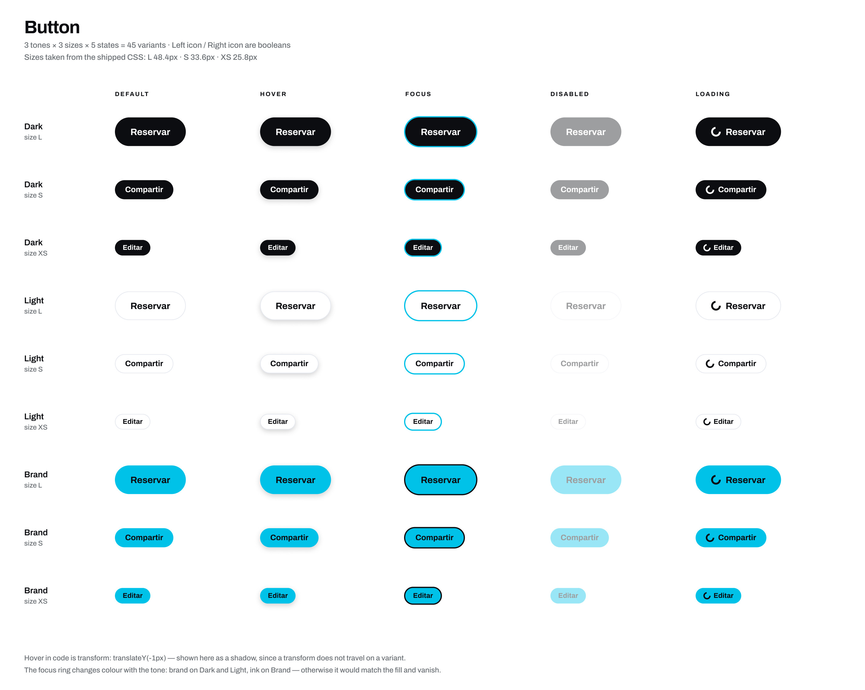
Props in code = properties in Figma
| Code | Figma | Property type |
|---|---|---|
| .pill-dark / -light / -blue | tone = Dark / Light / Brand | variant |
| .pill / -sm / -xs | size = L / S / XS | variant · added in this pass |
| disabled attribute | state = Disabled | variant |
| :hover translateY(-1px) | state = Hover | variant · shown as a shadow, a transform does not travel on a variant |
| ring-[#0b0d10] | state = Focus | variant |
| Loader2 animate-spin, six copies | state = Loading | variant in Figma, copy-paste in code — open debt |
| icon before / after the label | Left icon / Right icon | boolean |
Rules that travel with the component
Each of these is written into the component description in Figma, so it arrives with the component instead of living in a document nobody opens.
Button
- For
- Anything that changes state — book, save, share, cancel. Dark is the screen’s one main action, Light is the alternative beside it, Brand is anything voice-related.
- Not for
- Navigation that changes nothing — that is a link. Two Dark buttons side by side means the main action has been named wrong: there is only one per screen.
- Limits
- Defined inside the theme scope on purpose, so the archived landing pages cannot inherit a restyle. S and XS are below the 44px touch minimum and are only allowed inside a row or header that has its own enlarged hit area.
Input
- For
- Text, email, password, search.
- Not for
- Dates, times and phone numbers. Each has its own component, and each exists because the native control misbehaves on the phones this audience owns.
- Limits
- The iOS placeholder is drawn only when the device is iOS and the field is empty — on every other engine the browser already draws one and the overlay doubled it. Height is pinned at 3.25rem, 3rem above 640px, because native date and time controls have a different intrinsic height per engine and the form row breaks alignment without it.
BlockCalendar
- For
- Picking a day or a range where some days are not pickable.
- Not for
- An unconstrained date. There the native control wins — it is cheaper, familiar, and opens the system picker.
- Limits
- It exists because <input type="date"> cannot disable arbitrary days: a master could pick an already-blocked date and only learn about it from an error after submitting. It is convenience, not validation — the server still answers 409 BLOCKED_OVERLAP. A blocked day is struck through, not only greyed, so colour is not the only signal.
How a change gets in
A one-person team can add a variant in ninety seconds, which is exactly why there has to be a gate. Four questions, in order — the first “no” ends it.
Has this case come up more than once, or is it one screen asking for a favour?
Can what exists express it, even imperfectly? A pixel of difference is not a reason.
Does the new option turn a clean axis into a list of special cases?
Add · widen the existing one · or leave it an exception and write down why.
Said no: two buttons in one row, two heights
15 May · commit ef8b7a5
- Was
- The voice button carried a bespoke padding: 0.6rem 1.1rem written inline, and the dashboard’s “+ Nueva cita” carried the same override. Side by side in the action row above the bookings list, they were visibly different heights. The obvious fix was a fourth size tier at the size both already wanted.
- Instead
- Both were pulled onto the existing pill-sm and the inline padding deleted.
- Why
- The case repeated, so it passed the first gate — but it failed the second: pill-sm is within a pixel of what the inline value was reaching for. Adding a fourth step would have turned a three-value size axis into a four-value one to serve a single row of a single screen. The follow-up sweep took the same tier to the remaining ten files.
Said yes: six phone fields, six ideas about the country code
19–20 May · commit 5ff7bb1
- Was
- Six raw phone inputs — registration, the booking page twice, the dashboard, settings, the voice invite — each with its own handling of the “+” prefix. People deleted it, doubled it, or typed a local number and got a message that never arrived.
- Instead
- One PhoneInput with the prefix locked outside the editable area, rolled through all six sites in one commit.
- Why
- Repeated six times, and the plain input genuinely could not say it: an unerasable prefix is behaviour, not styling. It also adds no axis to anything — it is a new component, not a new variant, so nothing else in the system got wider. The same shape settled NativeDateField two weeks later, again across six call sites.
Two platforms, and what accessibility is actually there
The dashboard is used one-handed between two clients, and the booking page is opened from a WhatsApp message. Both are phone-first in practice, which makes touch size a system property rather than a screen decision.
Touch targets, measured in a browser
- .pill48.4px — clears 44
- .pill-sm33.6px — below
- .pill-xs25.8px — below
- date / time field52px, 48px ≥640
Only the main tier passes on its own. The two smaller ones sit inside rows and headers with their own enlarged hit area, which is a mitigation and not a fix — so it is on the debt list below rather than in the win column.
What is in the code, counted — not an audit
- aria-label · aria-hidden26 · 21
- aria-expanded · pressed · live · busy4 · 3 · 1 · 1
- explicit roles6
- prefers-reduced-motion4
- label bound to field10
No WCAG audit has been run on this product and this chapter does not claim one. Contrast is the part that is genuinely systematic, because it is enforced by which token a role is allowed to point at.
One bug the token work found in itself
First pass, I pointed the framework’s --primary and --ring at the brand colour — it reads like the obviously correct move, and it was wrong. Both land on white: the route-loading spinner is a border-primary circle on the page background, and the dialog’s close button is what the library focuses when a dialog opens. Cyan there is 2.13:1 against a 3:1 floor for non-text graphics — the exact rule written at the top of the token file. Both roles now point at ink, 19.46:1, which is also what the app’s own focus rings were already doing in twelve places. A checkmark in the language menu came along for free: 2.03 → 18.62:1.
What it adds up to
Debt, written down rather than left implied
- Hex to tokens1 179 ink and 246 brand call sites are still literals. The rails exist; the sweep needs its own release and a pass over all 29 screens.
- Loading in the buttonSix hand-placed spinners instead of a state the component owns.
- Focus ring in the base classSet per call site today, not once in .pill.
- Touch size on S and XS33.6px and 25.8px, mitigated by their containers rather than fixed.
- Error state on fieldsA red border written by hand in every form instead of a state.
- Tab switcherThe same pattern written twice, in settings and in the share sheet.
A design system with no debt list is a system nobody has measured. These six are ordered by how much they cost the next change.
08 Who it’s for
Two people, and the silence between them
Written as design hypotheses, not research findings — I did not run a study. But every screen is answerable to one of them, and the ones that were not got cut.
Job 01 · the autónoma
“I am booked out for the week, but I am also the receptionist — and I am doing that job with wet hands, from a notebook, while somebody is in the chair.”
Job 02 · the client at eleven at night
“I want the appointment now, while I am thinking about it — not to send a message and wait until tomorrow to find out if that time is even free.”
The dangerous moment is neither of those. It is the gap between booking and turning up, where a client forgets, double-books herself, or quietly decides not to come. The dip in the line below is the whole reason chapters 05 and 06 exist.

Taps a link from a bio, a Story or a reply
Reads services, price and duration
Day, time, name, phone — or dictates the lot
Waits, for days, with nothing to do
Turns up and pays the master directly
Gets asked for a review, rebooks from the same link
“Is this a real business or a dead page?”
“What does it cost and how long am I here?”
“Did that register, or should I message her too?”
“Was it Thursday or Friday?”
“Was that worth the price?”
“Do I have to find the link again?”
A profile with no way to book anything
“Precio a consultar” — the answer to nothing
A form demanding an account first
Silence — the single biggest cause of a no-show
The slot was double-booked on paper
Nothing carries over; next time starts from zero
A Story with real free slots and a QR
Price and minutes on the row, tinted per service
No account; confirmation on the spot
Reminder the day before, plus a one-tap cancel link
Server-side collision check — it cannot happen
Review request, follow-up, details remembered
Find
- Thinking
- “Is this a real business or a dead page?”
- Pain
- A profile with no way to book anything
- Answered by
- A Story with real free slots and a QR
Choose
- Thinking
- “What does it cost and how long am I here?”
- Pain
- “Precio a consultar” — the answer to nothing
- Answered by
- Price and minutes on the row, tinted per service
Book
- Thinking
- “Did that register, or should I message her too?”
- Pain
- A form demanding an account first
- Answered by
- No account; confirmation on the spot
Wait — the dip
- Thinking
- “Was it Thursday or Friday?”
- Pain
- Silence — the single biggest cause of a no-show
- Answered by
- Reminder the day before, plus a one-tap cancel link
Attend
- Thinking
- “Was that worth the price?”
- Pain
- The slot was double-booked on paper
- Answered by
- Server-side collision check — it cannot happen
Return
- Thinking
- “Do I have to find the link again?”
- Pain
- Nothing carries over; next time starts from zero
- Answered by
- Review request, follow-up, details remembered
09 Architecture
The app, mapped
One React app and one Express API. Five surfaces hang off it, and every one renders through the same tokens against the same nine tables.
Client
- Public page · /b/:slug
- Four-step wizard
- Voice booking
- Cancel · review · deposit
Master
- Day & week dashboard
- Clients & statistics
- Services, hours, blocks
- Share kit & promo codes
Notifications
- Transactional email
- Web push
- Ten scheduled jobs
Billing
- Stripe subscription · €15
- 20-day trial, no card
- Client deposits
- Webhook idempotency
Admin
- Activity feed
- Per-master drill-down
- Force-cancel
- Bulk test-data cleanup
10 How it was built
Three things the product taught me
Working solo means nobody argues back, which makes a bad decision very easy to keep. The code was written with AI assistance; I set the direction, made the product calls and reviewed what landed — and the things that went wrong went wrong where no assistant can see them.
The trial was too short to reach a second week
19 May
- Was
- A 14-day free trial.
- Became
- Twenty days, with everyone on the old clock topped up by hand.
- Why
- Fourteen days is not two weeks of use for someone who works Tuesday to Saturday and only sets things up on a quiet Monday. Twenty buys a second full cycle — the first point at which the product has proved anything.
Headless Chrome cannot see an iPhone
4–5 June
- Was
- Native date and time inputs everywhere, verified in WebKit.
- Became
- Two purpose-built components — after two fixes that shipped and made it worse.
- Why
- On a real iPhone the empty date field rendered blank. The first fix was a styling hack; the second overlaid a placeholder that doubled up on the actual device. Playwright’s WebKit is not iOS Safari.
Guardrails before speed
19 May, after the third incident
- Was
- Three deploys in a row lost production environment variables.
- Became
- One vault file as the source of truth, a script that derives the required keys by grepping every process.env read, and a pre-deploy hook that refuses an unsafe sync.
- Why
- “Be more careful” is not a fix. The hook has blocked one bad sync since.
I was the review gate
The blank date field on a real iPhone. A booking created on the wrong day, invisible until reload. Service names frozen in the language the master typed them in, on five different screens. None of that shows up in a test suite — it shows up when you use the thing as the person who pays for it.
Three analytics stacks, a feature flag and a running experiment exist so the arguments I cannot win on taste get settled by traffic instead. The one number I will not put on this page is how many people pay for it — that is not mine to publish.
Live, in Spanish, in production
Designed, built and shipped
by one person.
Landing, public booking page, master dashboard, voice booking, WhatsApp notifications, Stripe billing and an admin console — running in Madrid, in six languages.
citameya.com↗